# install.packages("ggpubr") # only if needed
# install.packages("survival")
library(ggpubr)
Loading required package: ggplot2library(survival)ggpubr with the ovarian datasetLearn how to visualize data and perform statistical tests using the ggpubr package.
ggpubr and survival packages installed (install.packages("ggpubr") and install.packages("survival"))First, ensure you have the ggpubr and survival packages installed and loaded.
# install.packages("ggpubr") # only if needed
# install.packages("survival")
library(ggpubr)Loading required package: ggplot2library(survival)ovarian DatasetLoad and inspect the ovarian dataset.
data(ovarian)Warning in data(ovarian): data set 'ovarian' not foundhead(ovarian) futime fustat age resid.ds rx ecog.ps
1 59 1 72.3315 2 1 1
2 115 1 74.4932 2 1 1
3 156 1 66.4658 2 1 2
4 421 0 53.3644 2 2 1
5 431 1 50.3397 2 1 1
6 448 0 56.4301 1 1 2For this exercise, we will categorize the age variable and create a new factor variable for it.
ovarian$age_group <- cut(ovarian$age, breaks = c(0, 50, 60, Inf), labels = c("<=50", "51-60", ">60"))
head(ovarian)
futime fustat age resid.ds rx ecog.ps age_group
1 59 1 72.3315 2 1 1 >60
2 115 1 74.4932 2 1 1 >60
3 156 1 66.4658 2 1 2 >60
4 421 0 53.3644 2 2 1 51-60
5 431 1 50.3397 2 1 1 51-60
6 448 0 56.4301 1 1 2 51-60Create a box plot to visualize the distribution of futime (survival time) across different age_group.
ggboxplot(ovarian, x = "age_group", y = "futime",
          color = "age_group", palette = "jco",
          add = "jitter") +
  stat_compare_means(method = "anova")
Conduct a t-test to compare the mean survival time between two age groups (<=50 and >60).
t_test_result <- t.test(futime ~ age_group, data = ovarian, subset = age_group %in% c("<=50", ">60"))
t_test_result
    Welch Two Sample t-test

data:  futime by age_group
t = 4.5119, df = 6.9821, p-value = 0.002777
alternative hypothesis: true difference in means between group <=50 and group >60 is not equal to 0
95 percent confidence interval:
 301.4059 965.9751
sample estimates:
mean in group <=50  mean in group >60
          889.8333           256.1429
# Add t-test result to the plot
ggboxplot(ovarian, x = "age_group", y = "futime",
color = "age_group", palette = "jco",
add = "jitter") +
stat_compare_means(method = "t.test",
comparisons = list(c("<=50", ">60")),
label = "p.signif")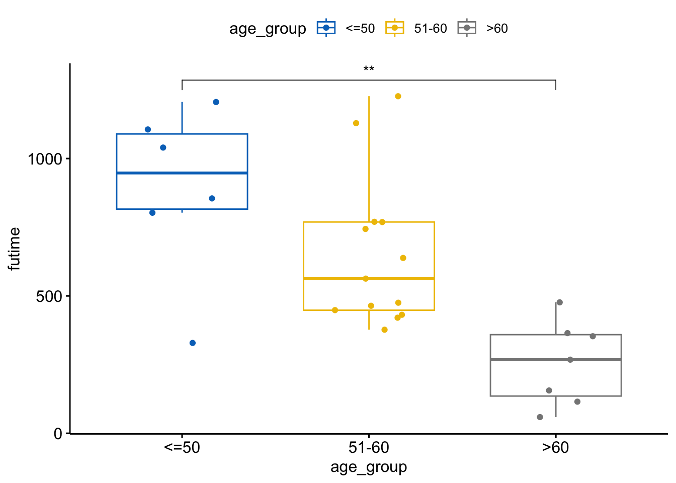
Conduct an ANOVA test to compare the mean survival time across all age groups.
anova_result <- aov(futime ~ age_group, data = ovarian)
summary(anova_result)
Df Sum Sq Mean Sq F value Pr(>F)
age_group 2 1364782 682391 10.33 0.000631 ***
Residuals 23 1519925 66084
---
Signif. codes: 0 '***' 0.001 '**' 0.01 '*' 0.05 '.' 0.1 ' ' 1# Add ANOVA result to the plot
ggboxplot(ovarian, x = "age_group", y = "futime",
color = "age_group", palette = "jco",
add = "jitter") +
stat_compare_means(method = "anova")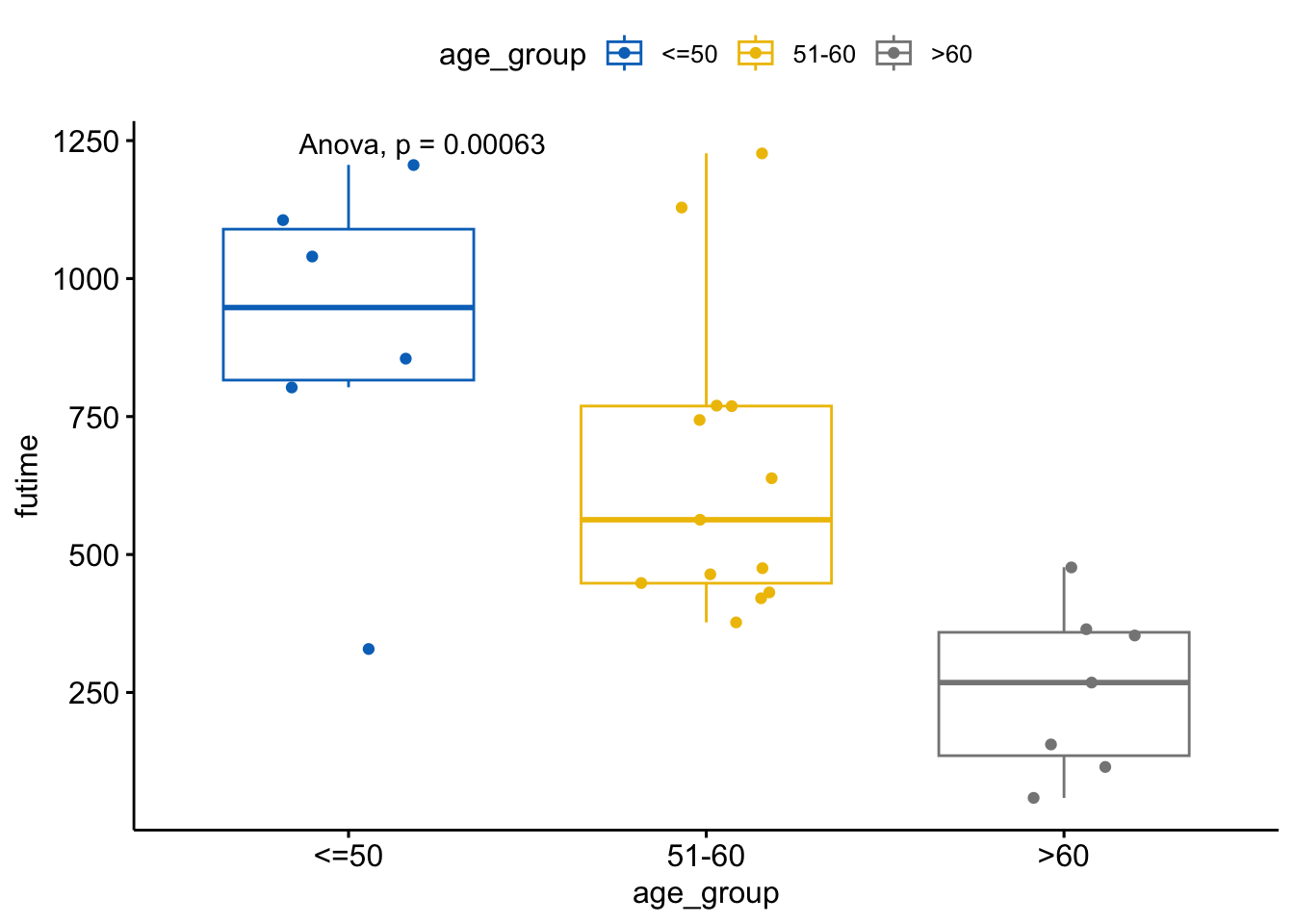
If ANOVA shows significant differences, perform Tukey’s HSD test for multiple comparisons.
tukey_result <- TukeyHSD(anova_result)
tukey_result
Tukey multiple comparisons of means
95% family-wise confidence level
Fit: aov(formula = futime ~ age_group, data = ovarian)
$age_group
diff lwr upr p adj
51-60-<=50 -239.3718 -557.1099 78.36630 0.1651785
>60-<=50 -633.6905 -991.8585 -275.52245 0.0005441
>60-51-60 -394.3187 -696.1290 -92.50836 0.0090334my_comparisons <- list( c("51-60", "<=50"),
c(">60", "<=50"),
c(">60", "51-60")
)
# Display Tukey's HSD test result
ggboxplot(ovarian, x = "age_group", y = "futime",
color = "age_group", palette = "jco",
add = "jitter") +
stat_compare_means(comparisons = my_comparisons, label = "p.signif") 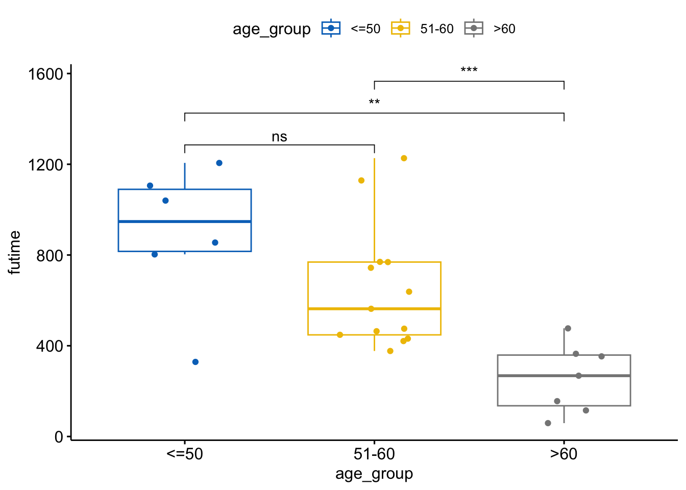
ggsave() to save your plot to a file.ggsave("ovarian_survival_plot.png")Saving 7 x 5 in imagetidyverse for Data Transformation and VisualizationEnsure you have the tidyverse, ggpubr, and survival packages installed and loaded.
library(tidyverse)── Attaching core tidyverse packages ──────────────────────── tidyverse 2.0.0 ──
✔ dplyr 1.1.4 ✔ readr 2.1.5
✔ forcats 1.0.0 ✔ stringr 1.5.1
✔ lubridate 1.9.3 ✔ tibble 3.2.1
✔ purrr 1.0.2 ✔ tidyr 1.3.1
── Conflicts ────────────────────────────────────────── tidyverse_conflicts() ──
✖ dplyr::filter() masks stats::filter()
✖ dplyr::lag() masks stats::lag()
ℹ Use the conflicted package (<http://conflicted.r-lib.org/>) to force all conflicts to become errorslibrary(ggpubr)
library(survival)
library(ggsci) # for Scientific Journal color PalettesWarning: package 'ggsci' was built under R version 4.3.3ovarian DatasetLoad and inspect the ovarian dataset.
data(ovarian)Warning in data(ovarian): data set 'ovarian' not foundhead(ovarian) futime fustat age resid.ds rx ecog.ps age_group
1 59 1 72.3315 2 1 1 >60
2 115 1 74.4932 2 1 1 >60
3 156 1 66.4658 2 1 2 >60
4 421 0 53.3644 2 2 1 51-60
5 431 1 50.3397 2 1 1 51-60
6 448 0 56.4301 1 1 2 51-60tidyverseUse mutate and cut to categorize the age variable.
ovarian <- ovarian %>%
  mutate(age_group = cut(age, breaks = c(0, 50, 60, Inf), labels = c("<=50", "51-60", ">60")))
head(ovarian)
futime fustat age resid.ds rx ecog.ps age_group
1 59 1 72.3315 2 1 1 >60
2 115 1 74.4932 2 1 1 >60
3 156 1 66.4658 2 1 2 >60
4 421 0 53.3644 2 2 1 51-60
5 431 1 50.3397 2 1 1 51-60
6 448 0 56.4301 1 1 2 51-60ggpubrCreate a box plot to visualize the distribution of futime (survival time) across different age_group.
ovarian %>%
  ggplot(aes(x = age_group, y = futime, color = age_group)) +
  geom_boxplot() +
  geom_jitter(width = 0.2) +
  ggpubr::stat_compare_means(method = "anova") +
  scale_color_jco() +
  labs(title = "Survival Time by Age Group", x = "Age Group", y = "Survival Time (days)") +
  theme_pubr()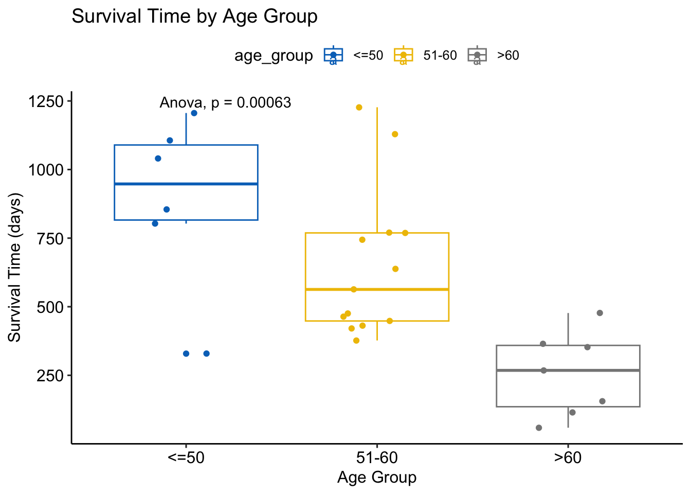
Conduct a t-test to compare the mean survival time between two age groups (<=50 and >60).
t_test_result <- ovarian %>%
  filter(age_group %in% c("<=50", ">60")) %>%
  t.test(futime ~ age_group, data=.)
print(t_test_result)
    Welch Two Sample t-test

data:  futime by age_group
t = 4.5119, df = 6.9821, p-value = 0.002777
alternative hypothesis: true difference in means between group <=50 and group >60 is not equal to 0
95 percent confidence interval:
 301.4059 965.9751
sample estimates:
mean in group <=50  mean in group >60
          889.8333           256.1429
# Add t-test result to the plot
ovarian %>%
filter(age_group %in% c("<=50", ">60")) %>%
ggplot(aes(x = age_group, y = futime, color = age_group)) +
geom_boxplot() +
geom_jitter(width = 0.2) +
ggpubr::stat_compare_means(method = "t.test", label = "p.signif", comparisons = list(c("<=50", ">60"))) +
scale_color_jco() +
labs(title = "Survival Time by Age Group", x = "Age Group", y = "Survival Time (days)")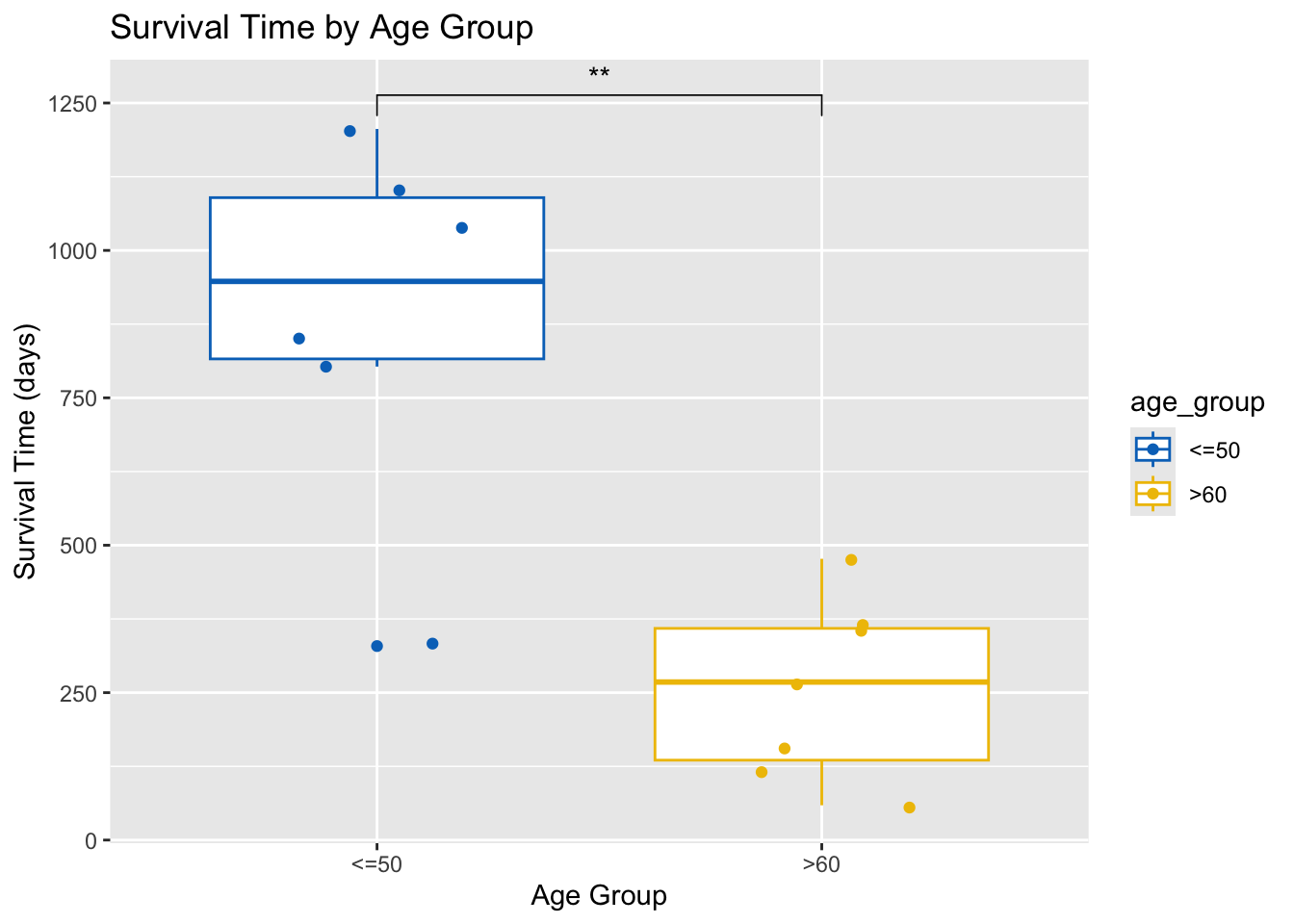
Conduct an ANOVA test to compare the mean survival time across all age groups.
anova_result <- aov(futime ~ age_group, data = ovarian)
summary(anova_result)
Df Sum Sq Mean Sq F value Pr(>F)
age_group 2 1364782 682391 10.33 0.000631 ***
Residuals 23 1519925 66084
---
Signif. codes: 0 '***' 0.001 '**' 0.01 '*' 0.05 '.' 0.1 ' ' 1# Add ANOVA result to the plot
ovarian %>%
ggplot(aes(x = age_group, y = futime, color = age_group)) +
geom_boxplot() +
geom_jitter(width = 0.2) +
ggpubr::stat_compare_means(method = "anova") +
scale_color_jco() +
labs(title = "Survival Time by Age Group", x = "Age Group", y = "Survival Time (days)")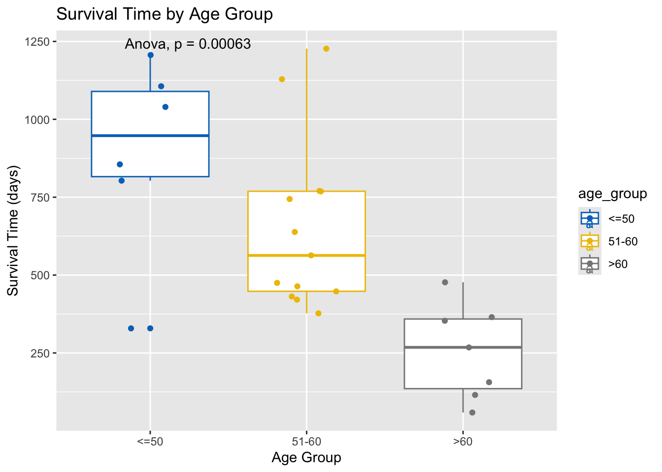
If ANOVA shows significant differences, perform Tukey’s HSD test for multiple comparisons.
tukey_result <- TukeyHSD(anova_result)
print(tukey_result)
Tukey multiple comparisons of means
95% family-wise confidence level
Fit: aov(formula = futime ~ age_group, data = ovarian)
$age_group
diff lwr upr p adj
51-60-<=50 -239.3718 -557.1099 78.36630 0.1651785
>60-<=50 -633.6905 -991.8585 -275.52245 0.0005441
>60-51-60 -394.3187 -696.1290 -92.50836 0.0090334my_comparisons <- list( c("51-60", "<=50"),
c(">60", "<=50"),
c(">60", "51-60")
)
# Display Tukey's HSD test result
ovarian %>%
ggplot(aes(x = age_group, y = futime, color = age_group)) +
geom_boxplot() +
geom_jitter(width = 0.2) +
stat_compare_means(comparisons = my_comparisons, label = "p.signif") +
scale_color_jco() +
labs(title = "Survival Time by Age Group", x = "Age Group", y = "Survival Time (days)")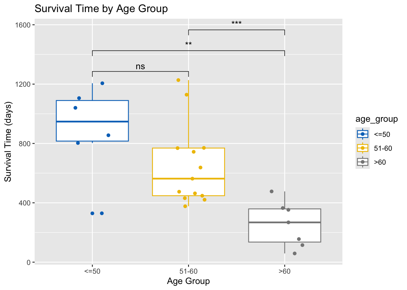
ggsave() to save your plot to a file.