Exercise: Analysis of a real dataset

Author
Affiliation

Valerio Licursi

IBPM-CNR

Published

June 26, 2024

Objective:

Perform statistical tests using the ggpubr package.

Prerequisites:

  • Basic knowledge of R and data frames
  • ggpubr and tidyverse packages installed (install.packages("ggpubr") and install.packages("tidyverse"))

Exercise Steps:

1. Install and Load Necessary Packages

library(tidyverse)
── Attaching core tidyverse packages ──────────────────────── tidyverse 2.0.0 ──
✔ dplyr     1.1.4     ✔ readr     2.1.5
✔ forcats   1.0.0     ✔ stringr   1.5.1
✔ ggplot2   3.5.1     ✔ tibble    3.2.1
✔ lubridate 1.9.3     ✔ tidyr     1.3.1
✔ purrr     1.0.2     
── Conflicts ────────────────────────────────────────── tidyverse_conflicts() ──
✖ dplyr::filter() masks stats::filter()
✖ dplyr::lag()    masks stats::lag()
ℹ Use the conflicted package (<http://conflicted.r-lib.org/>) to force all conflicts to become errors
library(ggpubr)

1. Import the dataset

gene_exp <- readxl::read_excel("../files_day2/gene_expression_irradiated.xlsx", sheet = 1)
New names:
• `` -> `...1`
head(gene_exp)
# A tibble: 6 × 7
  ...1      Dose  Time   rep1  rep2  rep3  rep4
  <chr>     <chr> <chr> <dbl> <dbl> <dbl> <dbl>
1 Ctrl 2h   Ctrl  2h     155.  139.  146.  146.
2 Ctrl 6h   Ctrl  6h     173.  182   150.  150.
3 Ctrl 24h  Ctrl  24h    180   130.  124.  151.
4 10 Gy 2h  Gy10  2h    1196. 1106.  680. 1040.
5 10 Gy 6h  Gy10  6h     618. 1010.  688.  663.
6 10 Gy 24h Gy10  24h    321.  288.  291.  266.

The first column doesn’t have a name therefore we can rename it:

gene_exp <- readxl::read_excel("../files_day2/gene_expression_irradiated.xlsx", sheet = 1) %>% 
  rename("sample" = `...1`)
New names:
• `` -> `...1`
head(gene_exp)
# A tibble: 6 × 7
  sample    Dose  Time   rep1  rep2  rep3  rep4
  <chr>     <chr> <chr> <dbl> <dbl> <dbl> <dbl>
1 Ctrl 2h   Ctrl  2h     155.  139.  146.  146.
2 Ctrl 6h   Ctrl  6h     173.  182   150.  150.
3 Ctrl 24h  Ctrl  24h    180   130.  124.  151.
4 10 Gy 2h  Gy10  2h    1196. 1106.  680. 1040.
5 10 Gy 6h  Gy10  6h     618. 1010.  688.  663.
6 10 Gy 24h Gy10  24h    321.  288.  291.  266.

3. Data Preparation

gene_exp <- pivot_longer(gene_exp, cols = starts_with("rep"), names_to = "rep")
head(gene_exp)
# A tibble: 6 × 5
  sample  Dose  Time  rep   value
  <chr>   <chr> <chr> <chr> <dbl>
1 Ctrl 2h Ctrl  2h    rep1   155.
2 Ctrl 2h Ctrl  2h    rep2   139.
3 Ctrl 2h Ctrl  2h    rep3   146.
4 Ctrl 2h Ctrl  2h    rep4   146.
5 Ctrl 6h Ctrl  6h    rep1   173.
6 Ctrl 6h Ctrl  6h    rep2   182 

4. Create a summary of the data

gene_exp_summary <- gene_exp %>%
  group_by(Dose, Time) %>%
  dplyr::summarise( 
    n=n(),
    mean=mean(value, na.rm = TRUE),
    sd=sd(value, na.rm = TRUE)
  ) %>%
  mutate( se=sd/sqrt(n))  %>%
  mutate( ypos = mean+sd+30)
`summarise()` has grouped output by 'Dose'. You can override using the
`.groups` argument.
gene_exp_summary
# A tibble: 6 × 7
# Groups:   Dose [2]
  Dose  Time      n  mean     sd     se  ypos
  <chr> <chr> <int> <dbl>  <dbl>  <dbl> <dbl>
1 Ctrl  24h       4  146.  25.3   12.6   201.
2 Ctrl  2h        4  147.   6.69   3.35  183.
3 Ctrl  6h        4  164.  16.4    8.20  210.
4 Gy10  24h       4  292.  22.6   11.3   344.
5 Gy10  2h        4 1006. 226.   113.   1262.
6 Gy10  6h        4  745. 179.    89.7   954.

5. Visualize the Data with a line plot

# Reorder factors
gene_exp$Dose <- ordered(gene_exp$Dose, levels=c("Ctrl", "Gy10"))
gene_exp$Time <- ordered(gene_exp$Time, levels=c("2h", "6h", "24h"))
gene_exp_summary$Dose <- ordered(gene_exp_summary$Dose, levels=c("Ctrl", "Gy10"))
gene_exp_summary$Time <- ordered(gene_exp_summary$Time, levels=c("2h", "6h", "24h"))

# Line plot ----
pd <- position_dodge(0) # avoid errorbar overlap
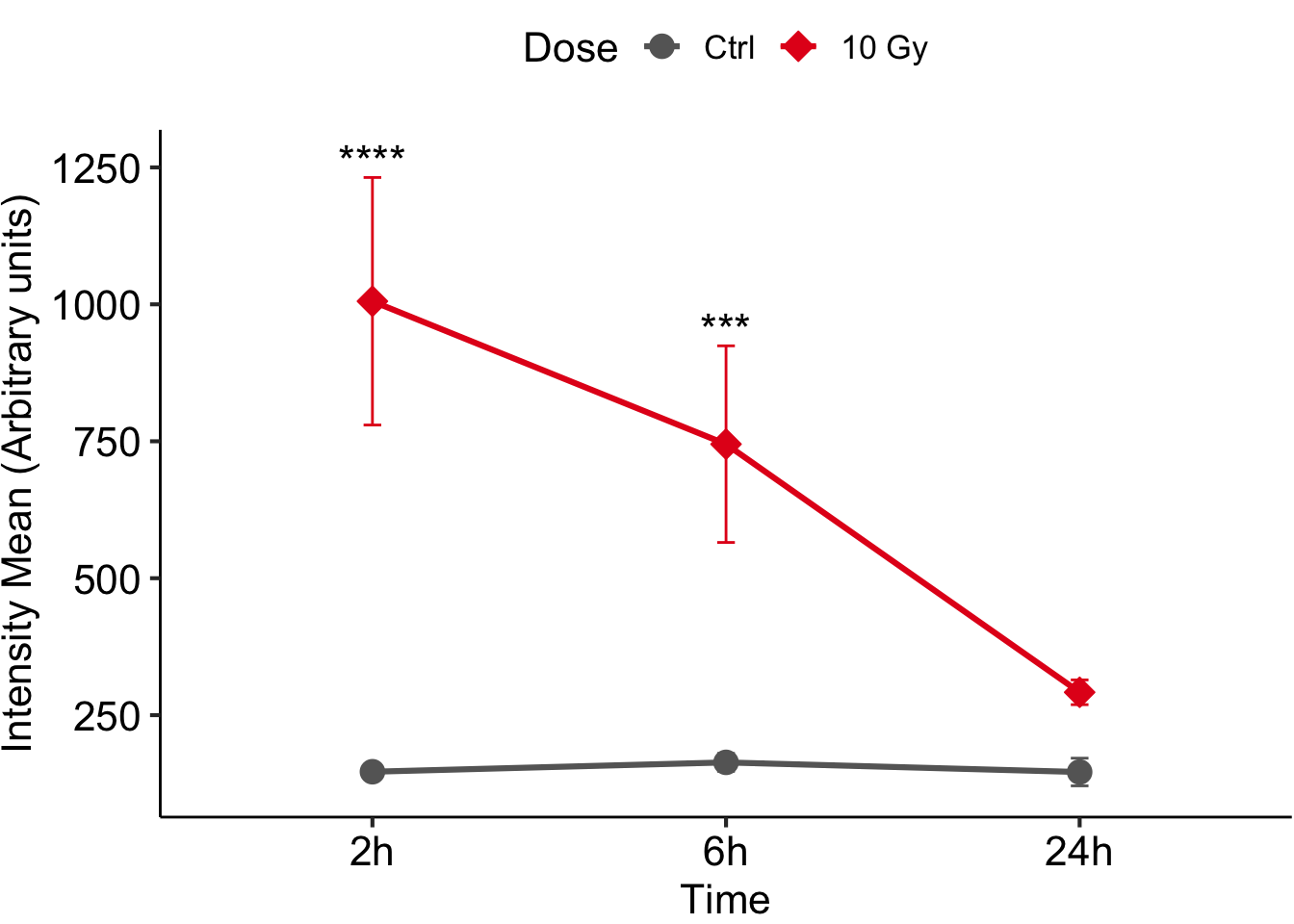
figure <-
  ggplot(data=gene_exp_summary, aes(x=Time, y=mean, colour=Dose, group=Dose)) + 
  geom_line(size=1.1, position=pd) +
  geom_point(size=4, aes(shape=Dose, fill=Dose), position = pd) + #oppure +geom_point(size=5, shape=21, fill='white') 
  geom_errorbar(aes(ymin=mean-sd, ymax=mean+sd, colour=Dose), width=0.1, position = pd) + 
  ylab("Intensity Mean (Arbitrary units)") +
  scale_shape_manual(values=c(21,23), labels = c("Ctrl", "10 Gy")) +
  scale_color_manual(values=c("grey40",  "#E41A1C"), labels = c("Ctrl", "10 Gy")) +
  scale_fill_manual(values=c("grey40", "#E41A1C"), labels = c("Ctrl", "10 Gy")) +
  annotate("text", x = c(1,2), y = c(gene_exp_summary$ypos[5], gene_exp_summary$ypos[6]), 
           label = c("****", "***"), 
           size = 6) +
  theme_pubr(base_size = 16, margin = FALSE, legend = "top")
Warning: Using `size` aesthetic for lines was deprecated in ggplot2 3.4.0.
ℹ Please use `linewidth` instead.
# scale_color_brewer(palette='') per cambiare colori su pattern preimpostati
figure

6. Perform ANOVA and post-hoc test

TukeyHSD(aov(value ~ sample, data=gene_exp)) %>% broom::tidy() %>% filter(adj.p.value <= 0.05)
# A tibble: 8 × 7
  term   contrast           null.value estimate conf.low conf.high  adj.p.value
  <chr>  <chr>                   <dbl>    <dbl>    <dbl>     <dbl>        <dbl>
1 sample 10 Gy 2h-10 Gy 24h          0     714.     447.      981. 0.00000136  
2 sample 10 Gy 6h-10 Gy 24h          0     453.     186.      720. 0.000492    
3 sample Ctrl 24h-10 Gy 2h           0    -859.   -1126.     -592. 0.0000000848
4 sample Ctrl 2h-10 Gy 2h            0    -859.   -1126.     -592. 0.0000000856
5 sample Ctrl 6h-10 Gy 2h            0    -842.   -1109.     -575. 0.000000117 
6 sample Ctrl 24h-10 Gy 6h           0    -599.    -866.     -332. 0.0000159   
7 sample Ctrl 2h-10 Gy 6h            0    -598.    -865.     -331. 0.0000161   
8 sample Ctrl 6h-10 Gy 6h            0    -581.    -848.     -314. 0.0000237