Volcano plot

Author

Valerio Licursi

Published

June 4, 2025

Exercise: Creating a Volcano Plot Using ggplot2

Objective:

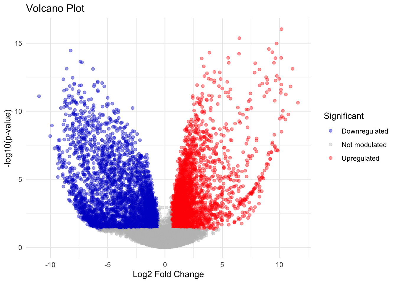
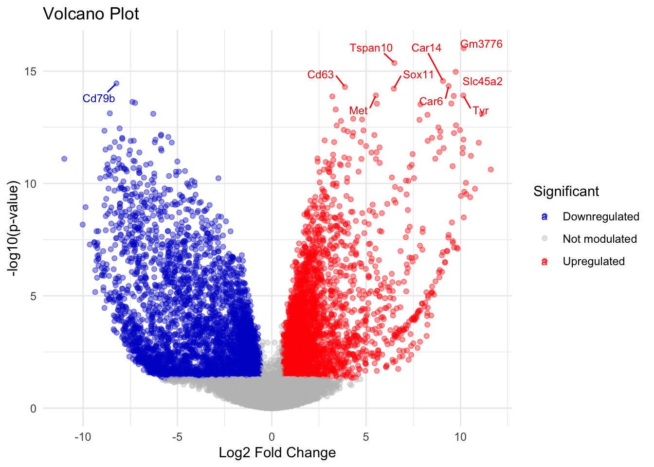
Learn how to create and interpret a volcano plot for visualizing differentially expressed genes (DEGs) from gene expression data using the ggplot2 package in R.

Prerequisites:

  • Basic knowledge of R and data manipulation
  • tidyverse and ggplot2 packages installed (install.packages(c("tidyverse", "ggplot2")))

Exercise Steps:

1. Install and Load Necessary Packages

Ensure you have the necessary packages installed and loaded.

library(tidyverse)
── Attaching core tidyverse packages ──────────────────────── tidyverse 2.0.0 ──
✔ dplyr     1.1.4     ✔ readr     2.1.5
✔ forcats   1.0.0     ✔ stringr   1.5.1
✔ ggplot2   3.5.1     ✔ tibble    3.2.1
✔ lubridate 1.9.3     ✔ tidyr     1.3.1
✔ purrr     1.0.2     
── Conflicts ────────────────────────────────────────── tidyverse_conflicts() ──
✖ dplyr::filter() masks stats::filter()
✖ dplyr::lag()    masks stats::lag()
ℹ Use the conflicted package (<http://conflicted.r-lib.org/>) to force all conflicts to become errors
library(ggplot2)
library(ggrepel)
library(readxl)

2. Load Gene Expression Data

For this exercise, we’ll use a gene expression dataset stored in an Excel file. Typically, you would have results from a differential expression analysis.

data <- read_excel("../_files_module_1/rnaseq.xlsx")
head(data)
# A tibble: 6 × 6
  ENSEMBL_ID         Gene_Symbol log2FC logCPM   pvalue adj_pvalue
  <chr>              <chr>        <dbl>  <dbl>    <dbl>      <dbl>
1 ENSMUSG00000111709 Gm3776       10.2    6.60 9.42e-17   1.42e-12
2 ENSMUSG00000039691 Tspan10       6.49   7.99 4.32e-16   3.25e-12
3 ENSMUSG00000022243 Slc45a2       9.75   7.63 1.07e-15   5.38e-12
4 ENSMUSG00000038526 Car14         9.07   6.99 2.73e-15   1.03e-11
5 ENSMUSG00000040592 Cd79b        -8.23   7.37 3.50e-15   1.05e-11
6 ENSMUSG00000028972 Car6          9.37   6.33 4.62e-15   1.09e-11
Set the thresholds for log2 Fold Change and pvalues
logfc_cutoff <- log2(1.5)
fdr_cutoff <- 0.05

# use ifelse() creating a new variable
data$significant <- ifelse(test = data$log2FC > logfc_cutoff & data$pvalue < fdr_cutoff, 
                           yes = "Upregulated", 
                           no = ifelse(data$log2FC < -logfc_cutoff & data$pvalue < fdr_cutoff, 
                                       yes = "Downregulated", 
                                       no = "Not modulated" )
                           )
head(data)
# A tibble: 6 × 7
  ENSEMBL_ID         Gene_Symbol log2FC logCPM   pvalue adj_pvalue significant  
  <chr>              <chr>        <dbl>  <dbl>    <dbl>      <dbl> <chr>        
1 ENSMUSG00000111709 Gm3776       10.2    6.60 9.42e-17   1.42e-12 Upregulated  
2 ENSMUSG00000039691 Tspan10       6.49   7.99 4.32e-16   3.25e-12 Upregulated  
3 ENSMUSG00000022243 Slc45a2       9.75   7.63 1.07e-15   5.38e-12 Upregulated  
4 ENSMUSG00000038526 Car14         9.07   6.99 2.73e-15   1.03e-11 Upregulated  
5 ENSMUSG00000040592 Cd79b        -8.23   7.37 3.50e-15   1.05e-11 Downregulated
6 ENSMUSG00000028972 Car6          9.37   6.33 4.62e-15   1.09e-11 Upregulated  

3. Create the Volcano Plot

Use ggplot2 to create a volcano plot. Points are colored based on their significance.

# Create the volcano plot
ggplot(data, aes(x = log2FC, y = -log10(pvalue), color = significant)) +
  geom_point(alpha = 0.4, size = 1.5) +
  scale_color_manual(values = c("blue3", "grey", "red")) +
  theme_minimal() +
  labs(title = "Volcano Plot",
       x = "Log2 Fold Change",
       y = "-log10(p-value)",
       color = "Significant")

4. Customize the Volcano Plot

Add more customization to enhance the plot, such as labeling the most significant points.

# Label the most significant points
top_genes <- data %>%
  filter(adj_pvalue < 0.01) %>%
  arrange(adj_pvalue) %>%
  head(10)

ggplot(data, aes(x = log2FC, y = -log10(pvalue), color = significant)) +
  geom_point(alpha = 0.4, size = 1.5) +
  geom_text_repel(data = top_genes, aes(label = Gene_Symbol),
                  size = 3, box.padding = 0.5) +
  scale_color_manual(values = c("blue3", "grey", "red")) +
  theme_minimal() +
  labs(title = "Volcano Plot",
       x = "Log2 Fold Change",
       y = "-log10(p-value)",
       color = "Significant")

5. Save the Plot

Save the plot to a file for use in presentations or reports.

ggsave("volcano_plot.png", width = 8, height = 6)

Additional Customizations:

  • Threshold Lines: Add horizontal and vertical lines to indicate thresholds for significance.
# Add threshold lines for log fold change and p-value
ggplot(data, aes(x = log2FC, y = -log10(pvalue), color = significant)) +
  geom_point(alpha = 0.4, size = 1.5) +
  geom_text_repel(data = top_genes, aes(label = Gene_Symbol),
                  size = 3, box.padding = 0.5) +
  scale_color_manual(values = c("blue3", "grey", "red")) +
  geom_hline(yintercept = -log10(0.05), linetype = "dashed", color = "black") +
  geom_vline(xintercept = c(-logfc_cutoff, logfc_cutoff), linetype = "dashed", color = "black") +
  theme_minimal() +
  labs(title = "Volcano Plot",
       x = "Log2 Fold Change",
       y = "-log10(p-value)",
       color = "Significant")

6. Save the Plot with thresholds

# Save the customized plot
ggsave("volcano_plot_with_thresholds.png", width = 8, height = 6)

Exercise for you: Use adjusted pvalues instead of pvalues for the volcano plot


References: