Learning Basic Functions of the tidyverse Package

Author

Valerio Licursi

Published

June 4, 2025

Introduction

By the end of this exercise, you will be familiar with basic data manipulation and visualization functions provided by the tidyverse package in R. This includes functions from dplyr and ggplot2 for data wrangling and visualization.

Prerequisites

  • tidyverse package installed (install.packages("tidyverse"))

Step 1: Loading Libraries and Dataset

library(tidyverse)
── Attaching core tidyverse packages ──────────────────────── tidyverse 2.0.0 ──
✔ dplyr     1.1.4     ✔ readr     2.1.5
✔ forcats   1.0.0     ✔ stringr   1.5.1
✔ ggplot2   3.5.1     ✔ tibble    3.2.1
✔ lubridate 1.9.3     ✔ tidyr     1.3.1
✔ purrr     1.0.2     
── Conflicts ────────────────────────────────────────── tidyverse_conflicts() ──
✖ dplyr::filter() masks stats::filter()
✖ dplyr::lag()    masks stats::lag()
ℹ Use the conflicted package (<http://conflicted.r-lib.org/>) to force all conflicts to become errors
data(mtcars)

Step 2: Data Manipulation with dplyr

3. Select Specific Columns

Use the select function to choose columns mpg, cyl, and hp from mtcars.

mtcars_selected <- mtcars %>% select(mpg, cyl, hp)
head(mtcars_selected)
                   mpg cyl  hp
Mazda RX4         21.0   6 110
Mazda RX4 Wag     21.0   6 110
Datsun 710        22.8   4  93
Hornet 4 Drive    21.4   6 110
Hornet Sportabout 18.7   8 175
Valiant           18.1   6 105

4. Filter Rows

Use the filter function to select cars with more than 6 cylinders.

mtcars_filtered <- mtcars_selected %>% filter(cyl > 6)
head(mtcars_filtered)
                    mpg cyl  hp
Hornet Sportabout  18.7   8 175
Duster 360         14.3   8 245
Merc 450SE         16.4   8 180
Merc 450SL         17.3   8 180
Merc 450SLC        15.2   8 180
Cadillac Fleetwood 10.4   8 205

5. Create a New Column

Use the mutate function to create a new column hp_per_cyl which is the horsepower divided by the number of cylinders.

mtcars_mutated <- mtcars_filtered %>% mutate(hp_per_cyl = hp / cyl)
head(mtcars_mutated)
                    mpg cyl  hp hp_per_cyl
Hornet Sportabout  18.7   8 175     21.875
Duster 360         14.3   8 245     30.625
Merc 450SE         16.4   8 180     22.500
Merc 450SL         17.3   8 180     22.500
Merc 450SLC        15.2   8 180     22.500
Cadillac Fleetwood 10.4   8 205     25.625

6. Summarize Data

Use the summarize function to calculate the average mpg and hp_per_cyl.

mtcars_summary <- mtcars_mutated %>% summarize(avg_mpg = mean(mpg), avg_hp_per_cyl = mean(hp_per_cyl))
mtcars_summary
  avg_mpg avg_hp_per_cyl
1    15.1       26.15179

7. Group by a Column

Use the group_by and summarize functions to get the average mpg for each cyl.

mtcars_grouped <- mtcars_selected %>% group_by(cyl) %>% summarize(avg_mpg = mean(mpg))
mtcars_grouped
# A tibble: 3 × 2
    cyl avg_mpg
  <dbl>   <dbl>
1     4    26.7
2     6    19.7
3     8    15.1

Step 3: Data Visualization with ggplot2

8. Create a Scatter Plot

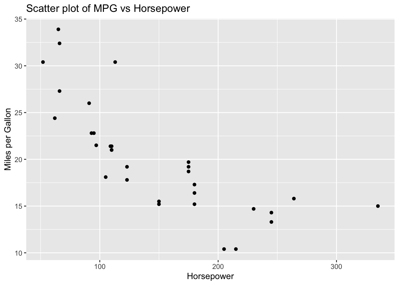
Use ggplot2 to create a scatter plot of mpg vs hp.

ggplot(data = mtcars, aes(x = hp, y = mpg)) +
  geom_point() +
  labs(title = "Scatter plot of MPG vs Horsepower",
       x = "Horsepower",
       y = "Miles per Gallon")

9. Create a Bar Plot

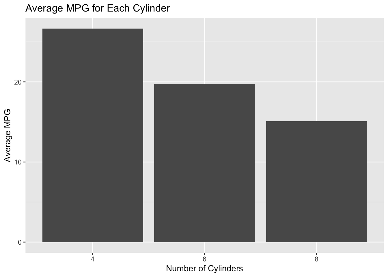
Use ggplot2 to create a bar plot showing the average mpg for each cyl.

ggplot(data = mtcars_grouped, aes(x = factor(cyl), y = avg_mpg)) +
  geom_bar(stat = "identity") +
  labs(title = "Average MPG for Each Cylinder",
       x = "Number of Cylinders",
       y = "Average MPG")

10. Create a Histogram

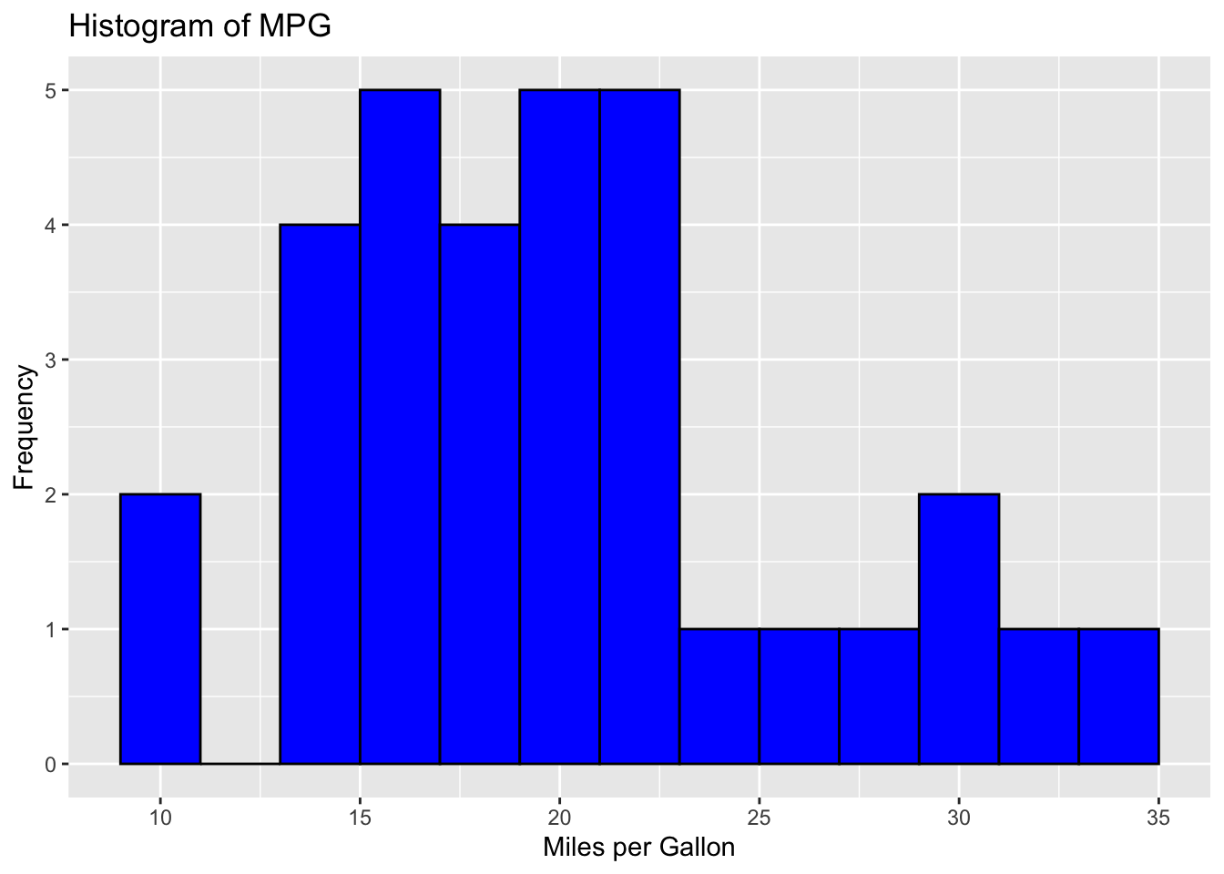
Use ggplot2 to create a histogram of the mpg values.

ggplot(data = mtcars, aes(x = mpg)) +
  geom_histogram(binwidth = 2, fill = "blue", color = "black") +
  labs(title = "Histogram of MPG",
       x = "Miles per Gallon",
       y = "Frequency")

Step 4: Combining Everything

Combine all steps into a single script to practice the workflow from data manipulation to visualization.

library(tidyverse)

# Load dataset
data(mtcars)

# Data manipulation
mtcars_selected <- mtcars %>% select(mpg, cyl, hp)
mtcars_filtered <- mtcars_selected %>% filter(cyl > 6)
mtcars_mutated <- mtcars_filtered %>% mutate(hp_per_cyl = hp / cyl)
mtcars_summary <- mtcars_mutated %>% summarize(avg_mpg = mean(mpg), avg_hp_per_cyl = mean(hp_per_cyl))
mtcars_grouped <- mtcars_selected %>% group_by(cyl) %>% summarize(avg_mpg = mean(mpg))

# Data visualization
# Scatter plot
ggplot(data = mtcars, aes(x = hp, y = mpg)) +
  geom_point() +
  labs(title = "Scatter plot of MPG vs Horsepower",
       x = "Horsepower",
       y = "Miles per Gallon")

# Bar plot
ggplot(data = mtcars_grouped, aes(x = factor(cyl), y = avg_mpg)) +
  geom_bar(stat = "identity") +
  labs(title = "Average MPG for Each Cylinder",
       x = "Number of Cylinders",
       y = "Average MPG")

# Histogram
ggplot(data = mtcars, aes(x = mpg)) +
  geom_histogram(binwidth = 2, fill = "blue", color = "black") +
  labs(title = "Histogram of MPG",
       x = "Miles per Gallon",
       y = "Frequency")

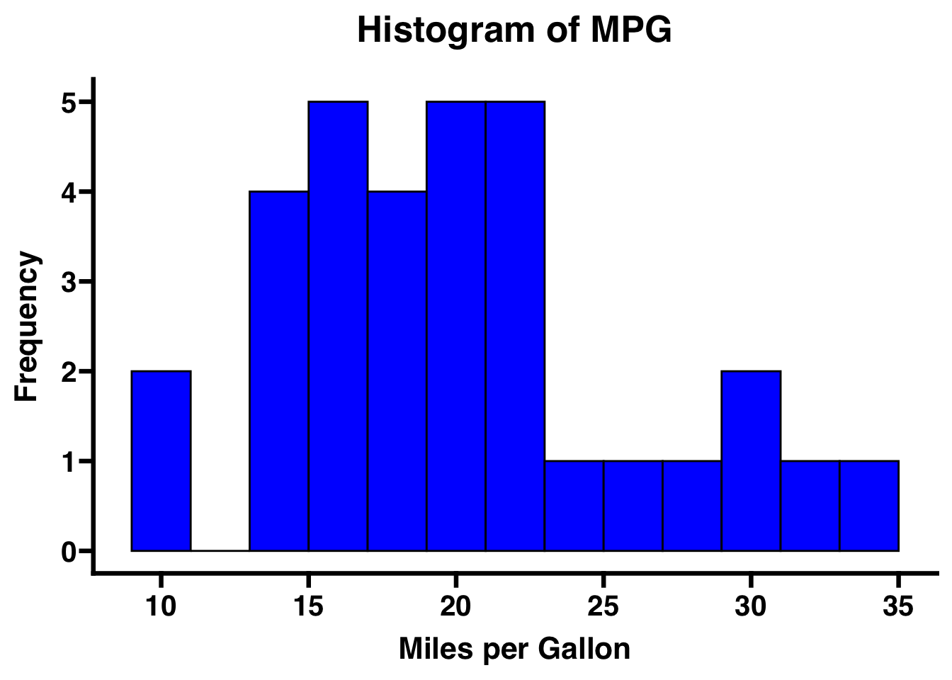
Bonus: “but I use GraphPad, this plot looks bad…”

library(ggprism)
Warning: package 'ggprism' was built under R version 4.3.3
ggplot(data = mtcars, aes(x = mpg)) +
  geom_histogram(binwidth = 2, fill = "blue", color = "black") +
  labs(title = "Histogram of MPG",
       x = "Miles per Gallon",
       y = "Frequency") +
 theme_prism(base_size = 16)

Exercise for you:

  • Apply the GraphPad theme to the scatter plot of MPG vs Horsepower

References