Introduction to ggplot2
2024-06-26
Creating a Basic Plot
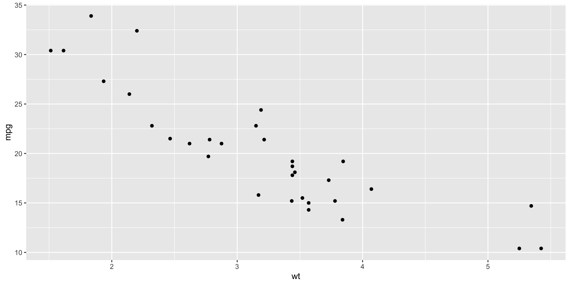
- ggplot() initializes the plot
- aes() maps the variables
- geom_point() adds a layer of points to the plot
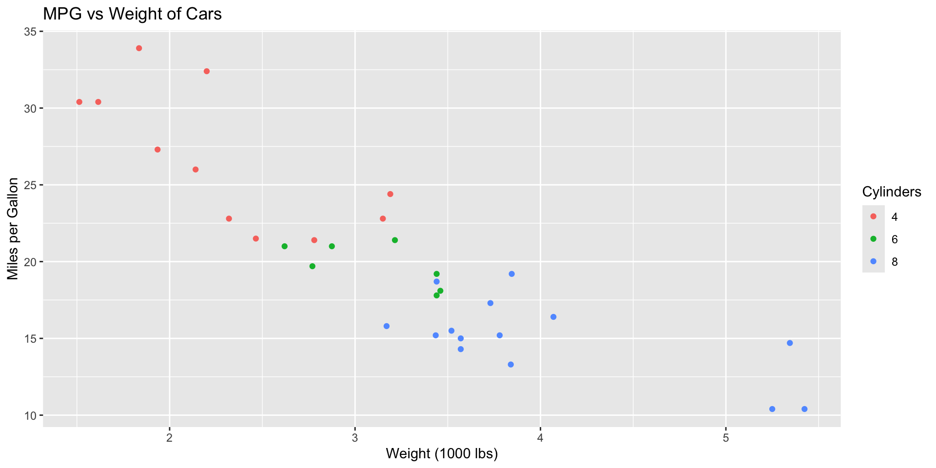
Adding Aesthetics
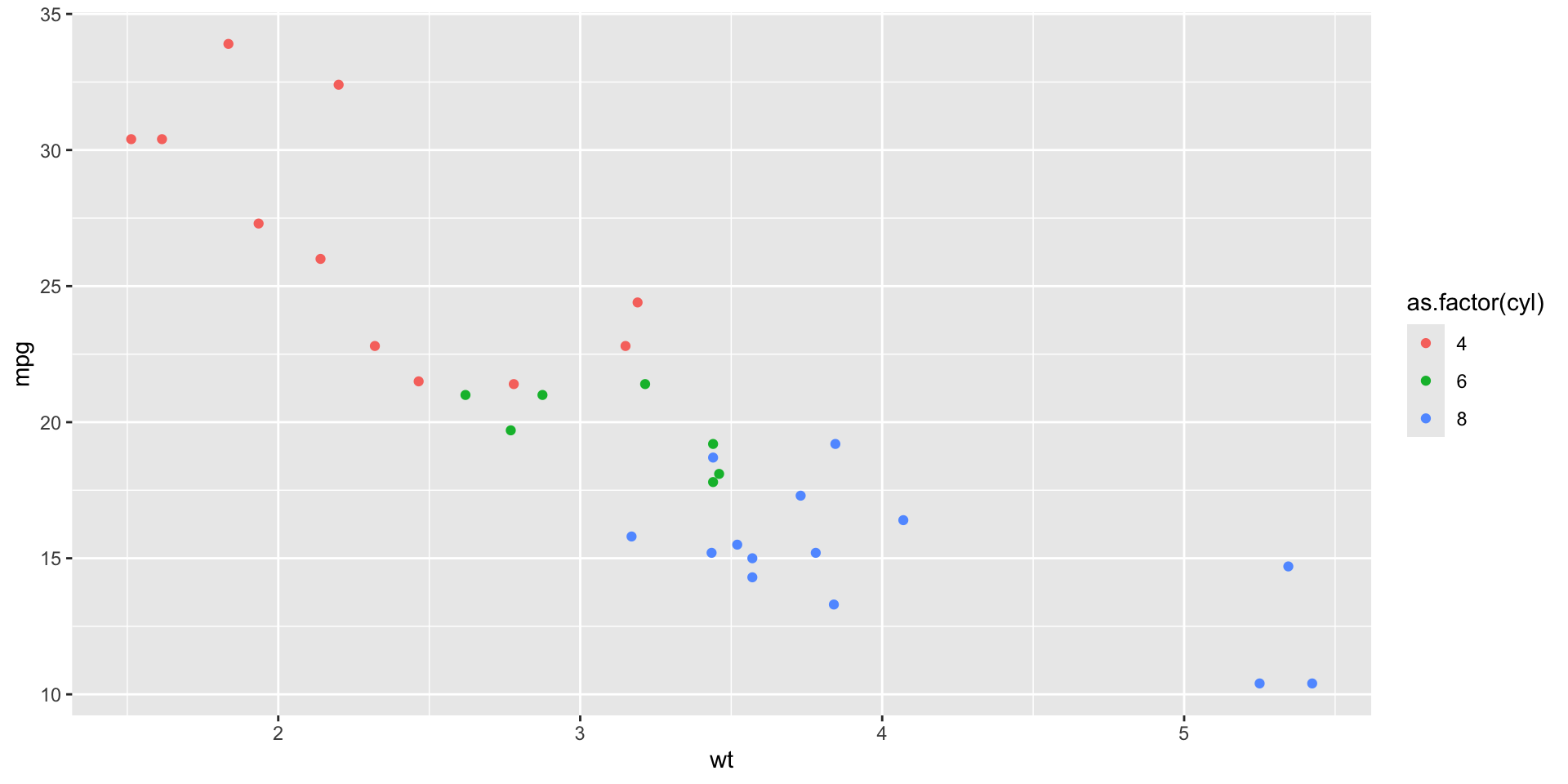
- color: Differentiates points by cylinder count
- Aesthetics can also include size, shape, and more
Titles and Labels
- ggtitle(): Adds a plot title
- xlab() and ylab(): Label the axes
- labs(): Additional labels, such as legends
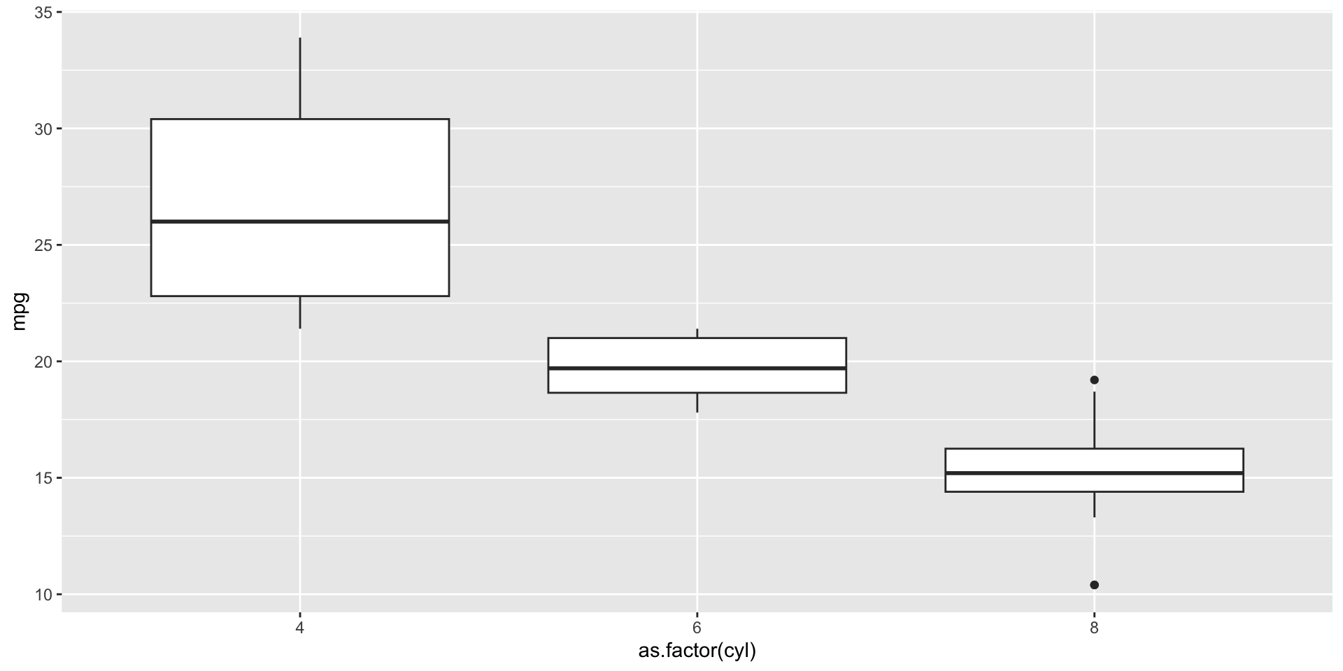
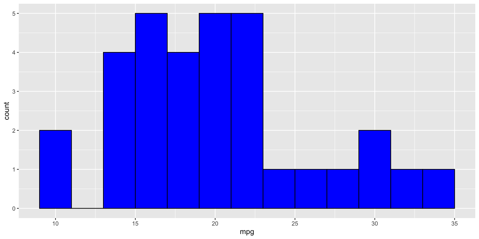
Boxplots and Histograms
Boxplot Example:
Histogram Example:
- geom_boxplot(): Creates boxplots
- geom_histogram(): Creates histograms with specified bin width
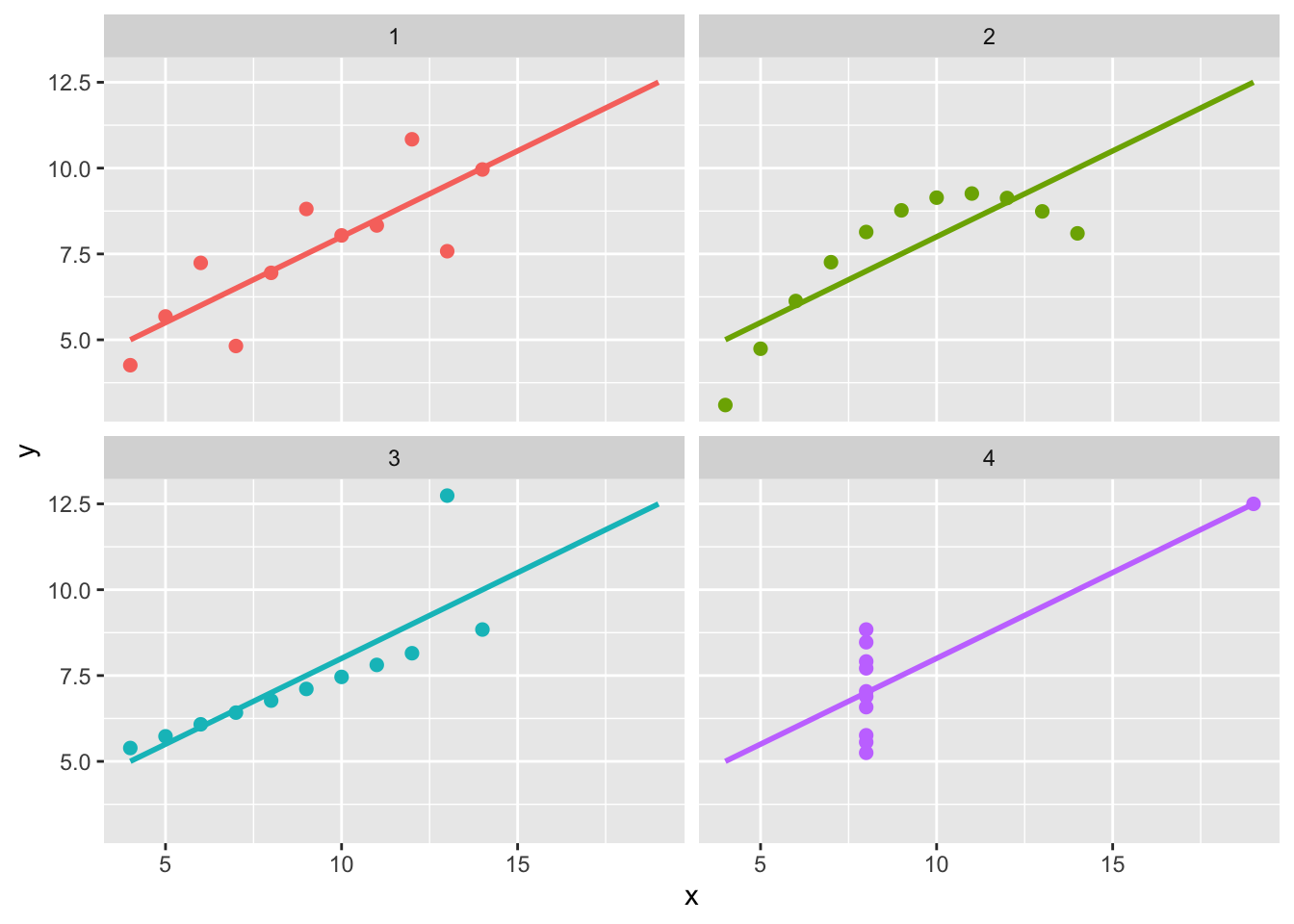
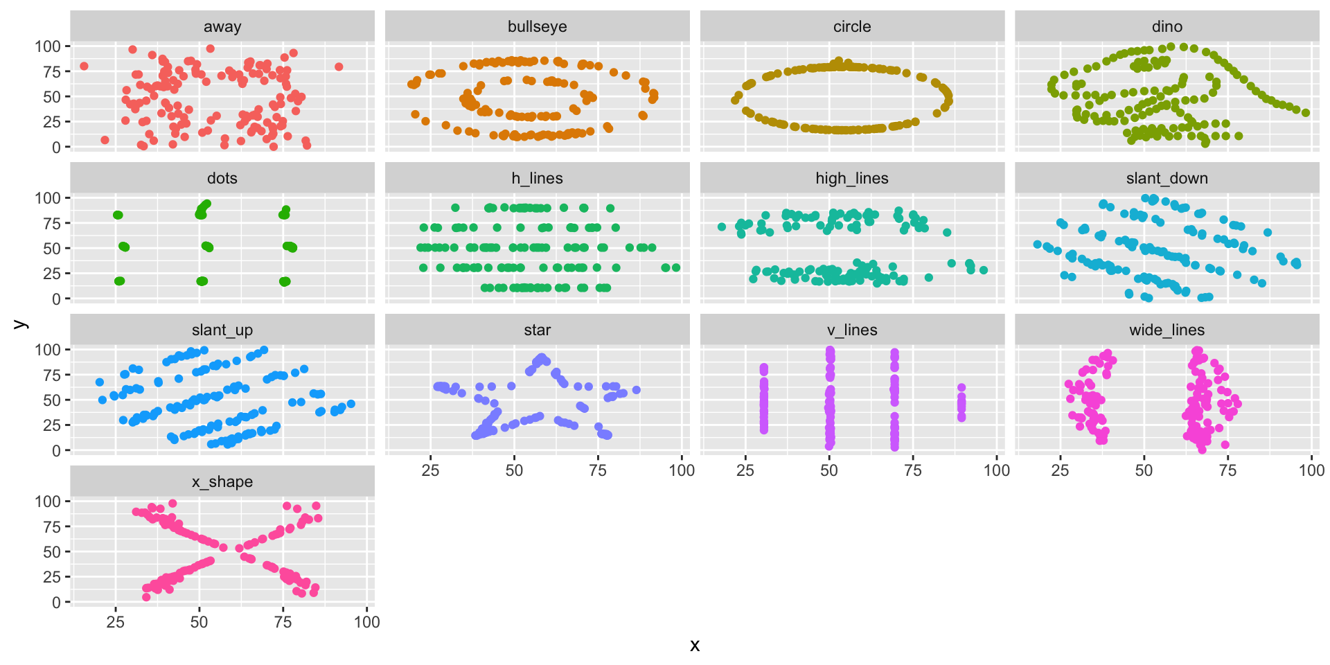
Faceting
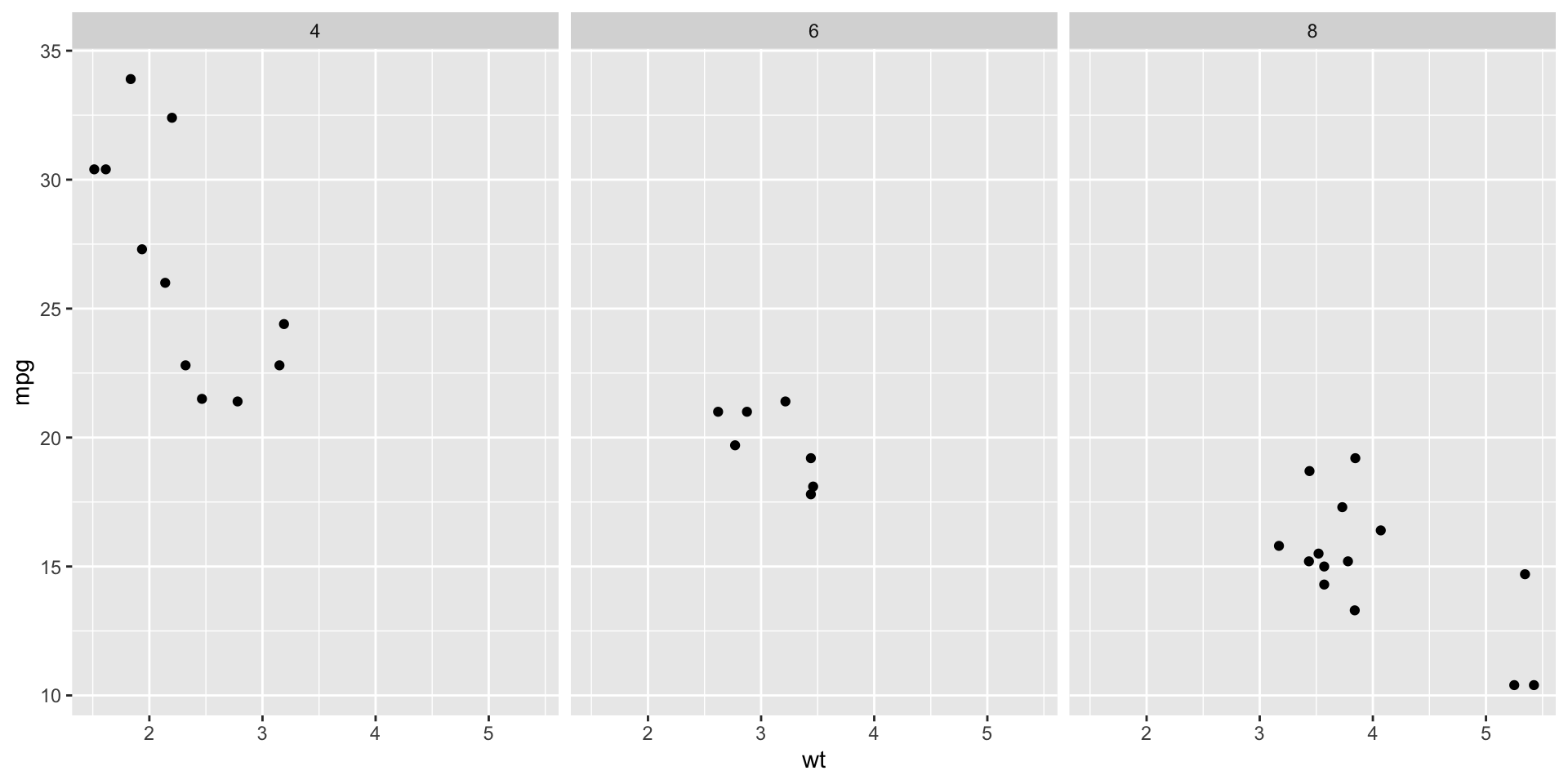
- facet_wrap(~ variable): Creates a separate plot for each level of the variable
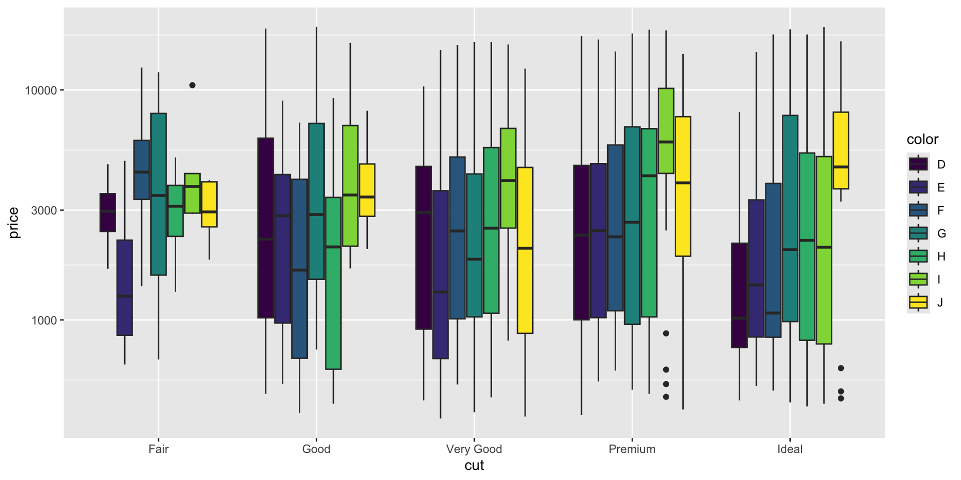
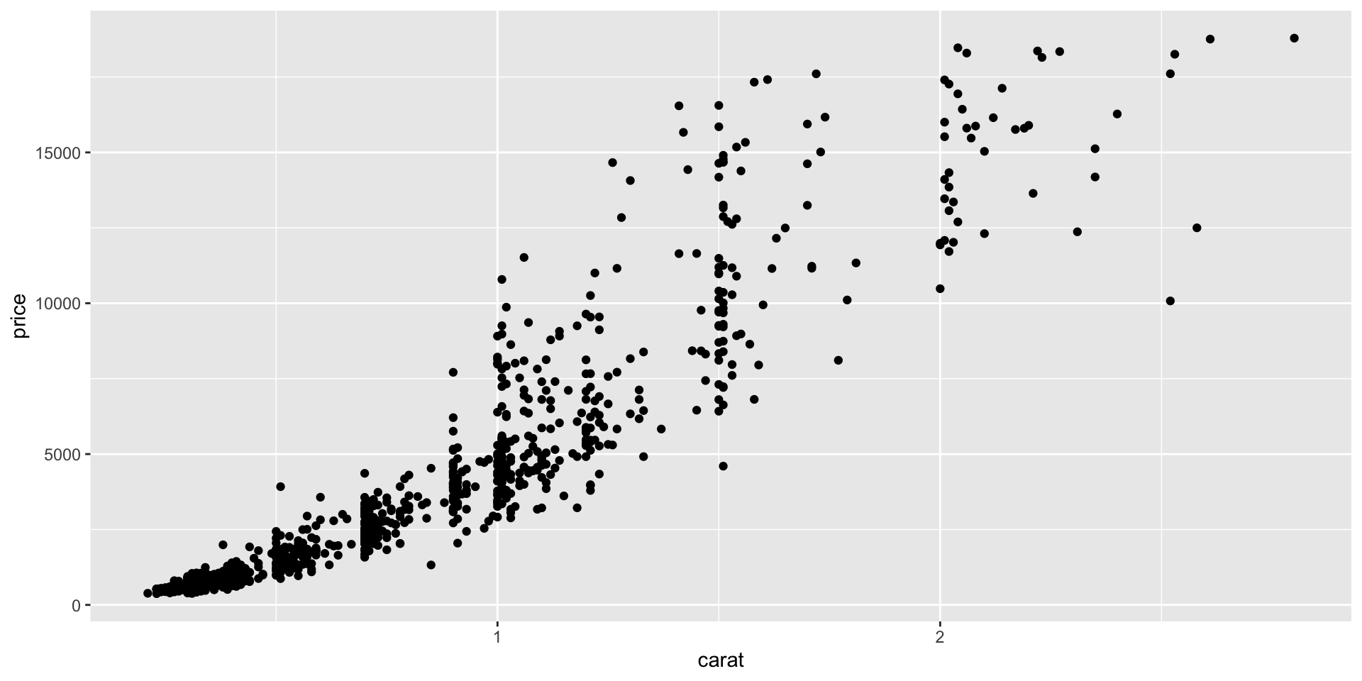
Example 1
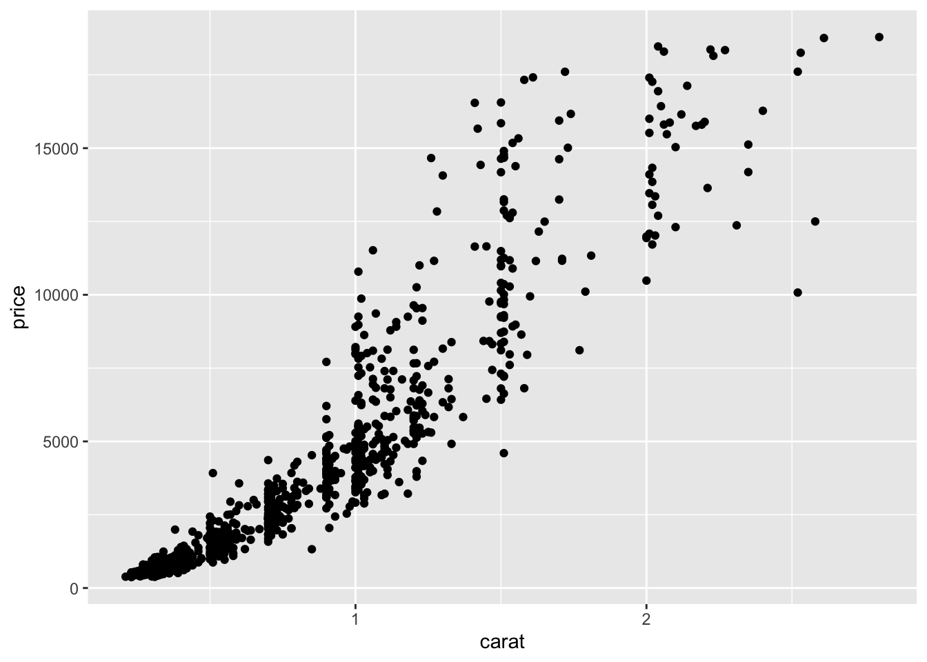
- Which data are used as an input?
- Are the variables transformed before plotting?
- What geometric objects are used to represent the data?
- What variables are mapped onto which aesthetic attributes?

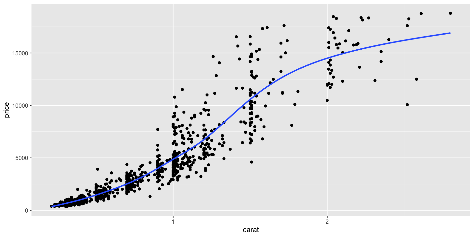
Altering aesthetics
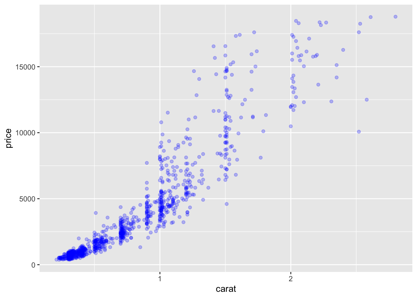
- How did the plot change?
- Are these changes based on data or are the changes based on stylistic choices for the geometric objects?

Example 2
- Which data are used as an input?
- Are the variables transformed before plotting?
- What geometric objects are used to represent the data?
- What variables are mapped onto which aesthetic attributes?

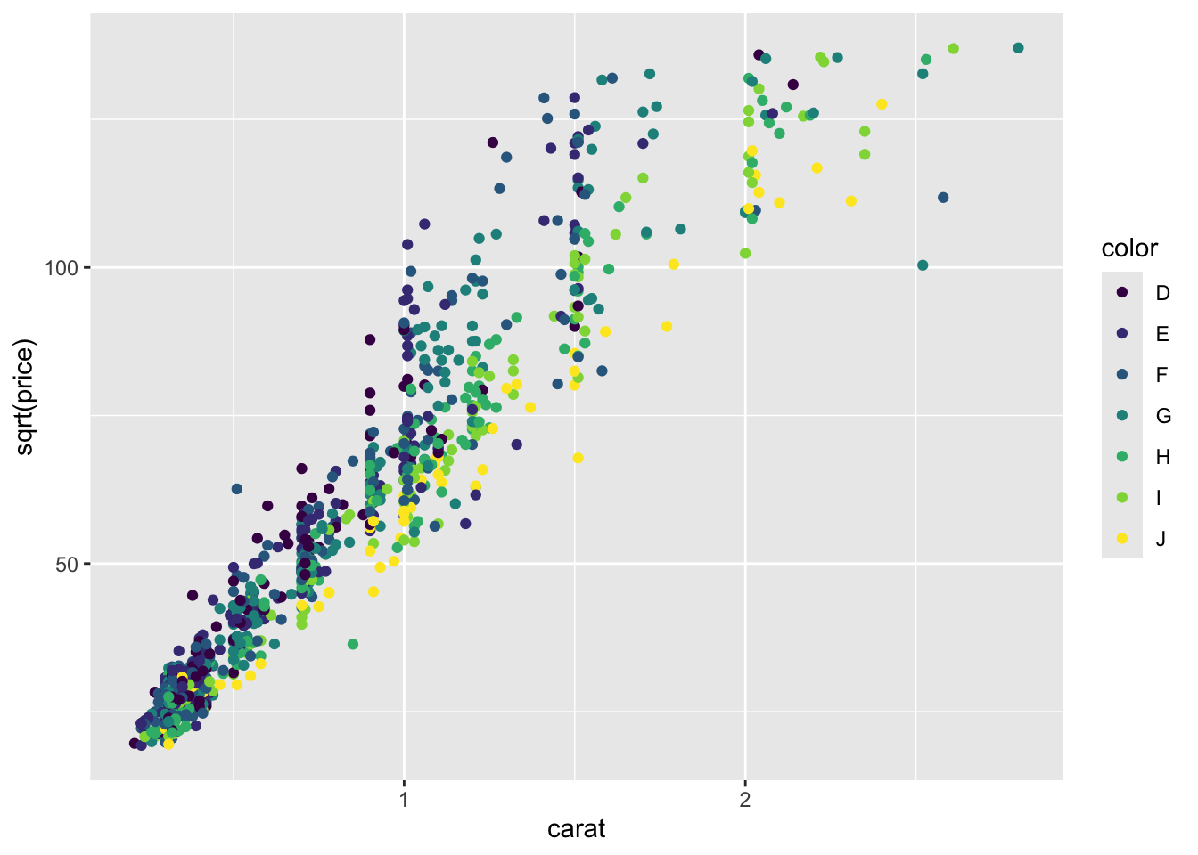
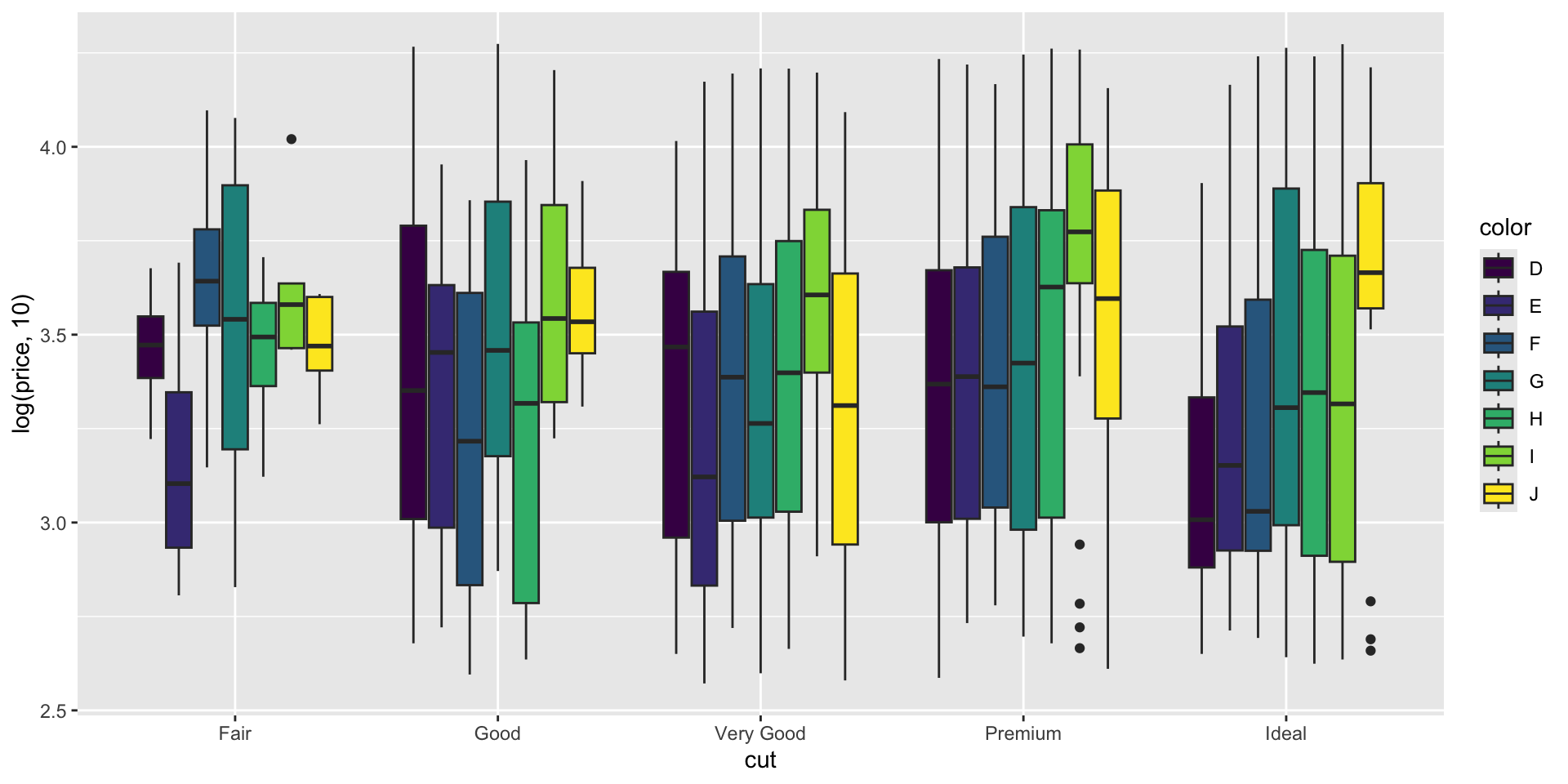
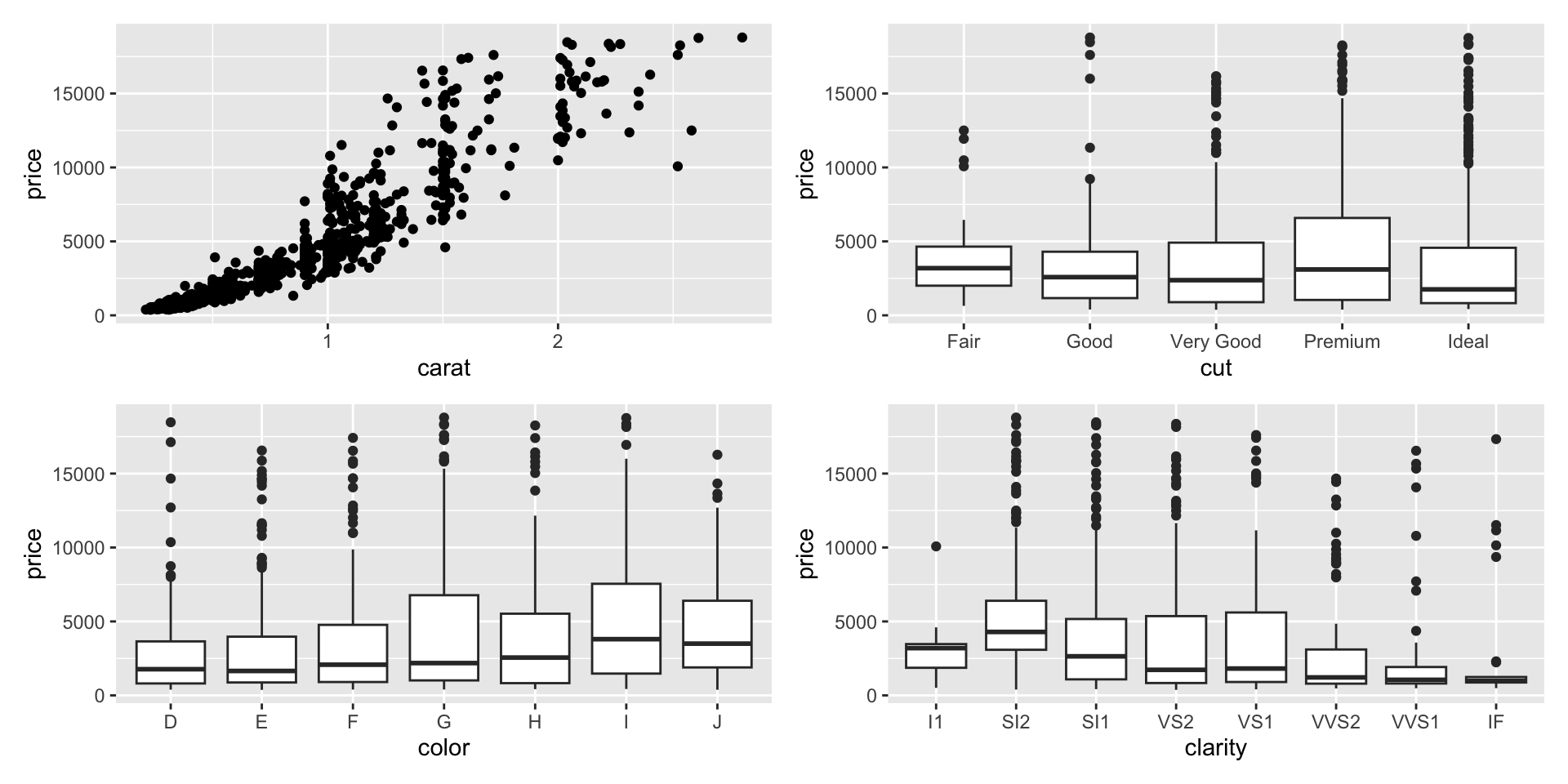
Example 3

- Which data are used as an input?
- Are the variables transformed before plotting?
- What geometric objects are used to represent the data?
- What variables are mapped onto which aesthetic attributes?
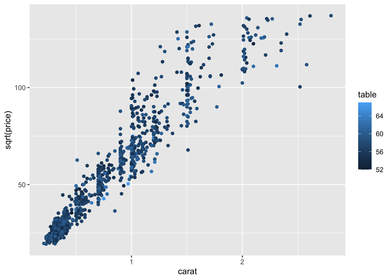
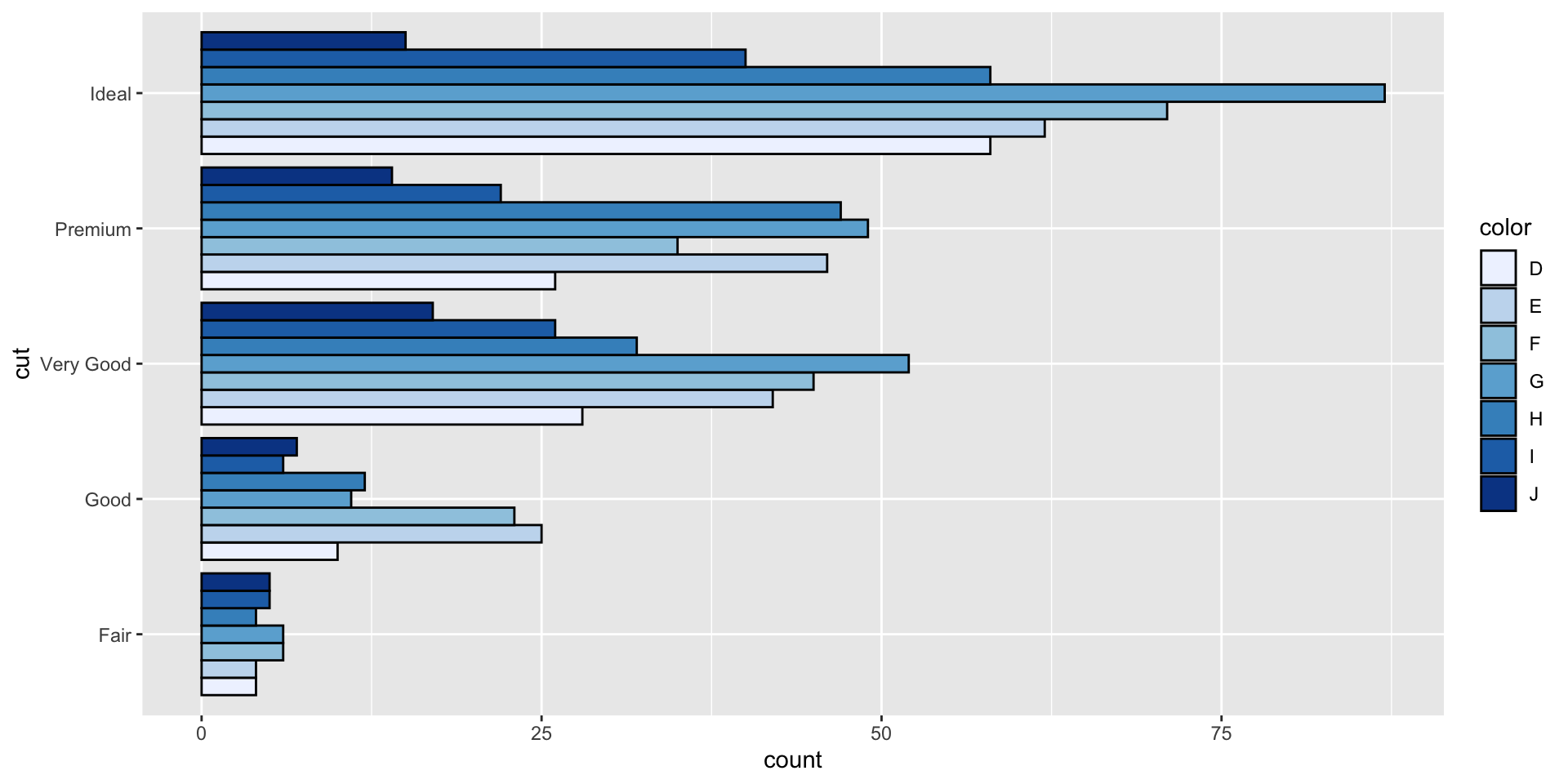
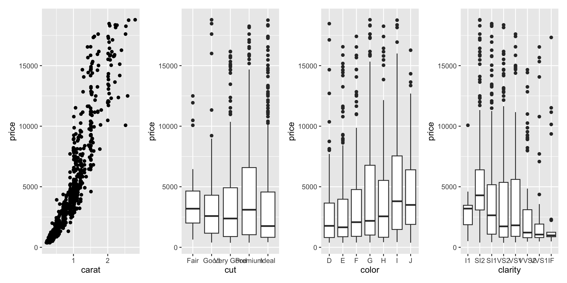
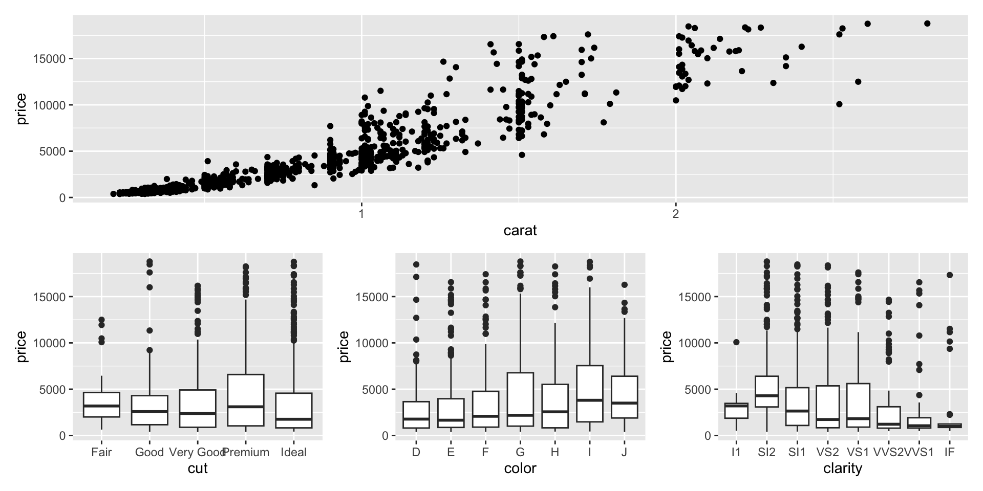
Example 4

- Which data are used as an input?
- Are the variables transformed before plotting?
- What geometric objects are used to represent the data?
- What variables are mapped onto which aesthetic attributes?
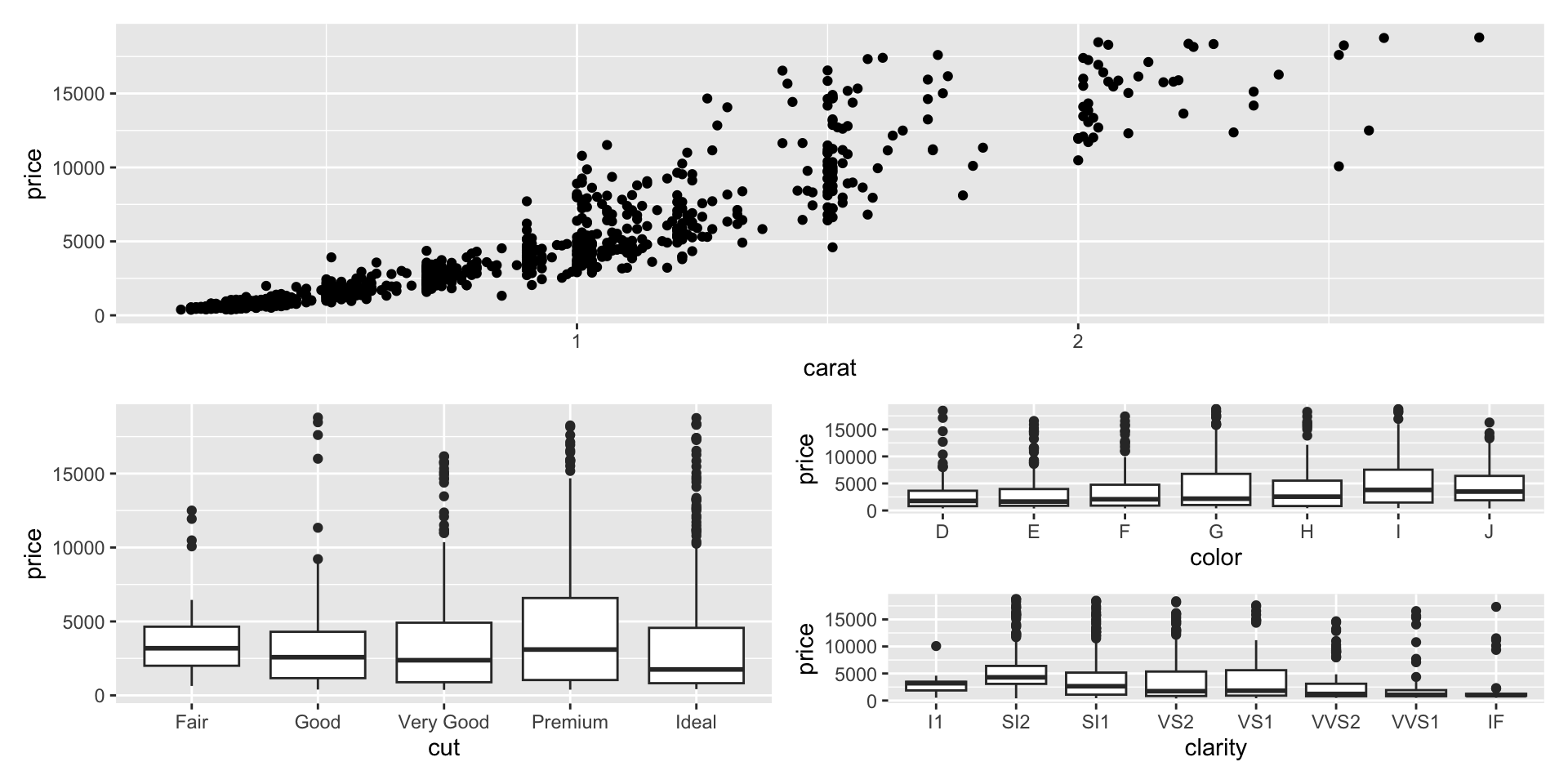
Example 5

- Which data are used as an input?
- Are the variables transformed before plotting?
- What geometric objects are used to represent the data?
- What variables are mapped onto which aesthetic attributes?
- What type of scales are used to map data to aesthetics?
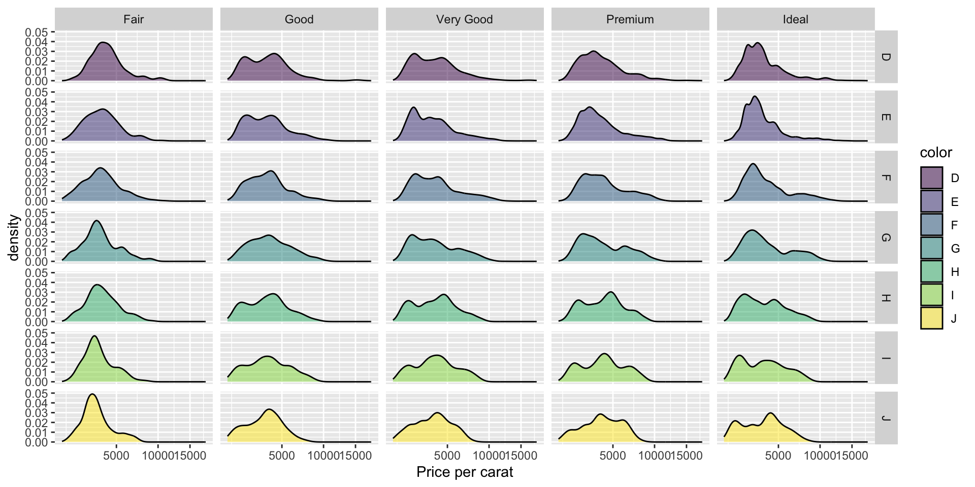
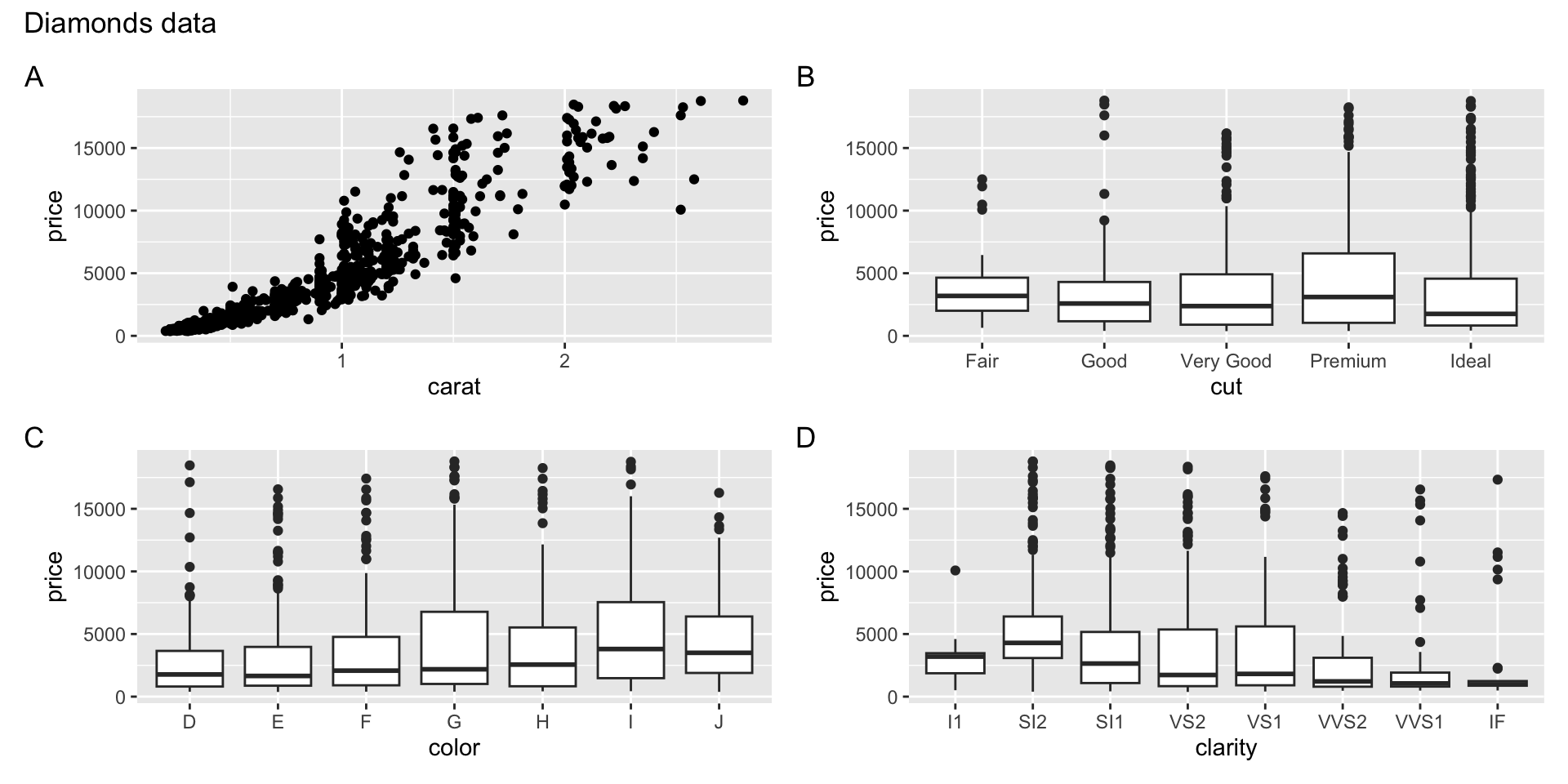
Example 6

- Which data are used as an input?
- Are the variables transformed before plotting?
- What geometric objects are used to represent the data?
- What variables are mapped onto which aesthetic attributes?
- What type of scales are used to map data to aesthetics?
ggplot objects
Tidy Anscombe