# install.packages("ggplot2") # don't execute it if you have already installed the package
library(ggplot2)Exercise: Introduction to ggplot2
Objective:
Learn how to create and customize basic plots using the ggplot2 package.
Prerequisites:
- Basic knowledge of R and data frames
ggplot2package installed (install.packages("ggplot2"))
Exercise Steps:
1. Install and Load ggplot2
First, ensure you have the ggplot2 package installed and loaded.
2. Load the mtcars Dataset
For this exercise, we will use the built-in mtcars dataset.
data(mtcars)
head(mtcars)
mpg cyl disp hp drat wt qsec vs am gear carb
Mazda RX4 21.0 6 160 110 3.90 2.620 16.46 0 1 4 4
Mazda RX4 Wag 21.0 6 160 110 3.90 2.875 17.02 0 1 4 4
Datsun 710 22.8 4 108 93 3.85 2.320 18.61 1 1 4 1
Hornet 4 Drive 21.4 6 258 110 3.08 3.215 19.44 1 0 3 1
Hornet Sportabout 18.7 8 360 175 3.15 3.440 17.02 0 0 3 2
Valiant 18.1 6 225 105 2.76 3.460 20.22 1 0 3 13. Create a Basic Scatter Plot
Use ggplot to create a scatter plot of mpg (miles per gallon) vs wt (weight of the car).
ggplot(data = mtcars, aes(x = wt, y = mpg)) +
  geom_point()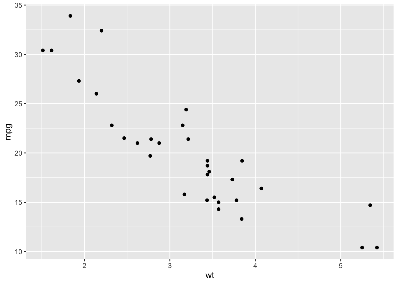
4. Add Aesthetics
Enhance your scatter plot by adding color to differentiate between the number of cylinders (cyl).
ggplot(data = mtcars, aes(x = wt, y = mpg, color = as.factor(cyl))) +
  geom_point()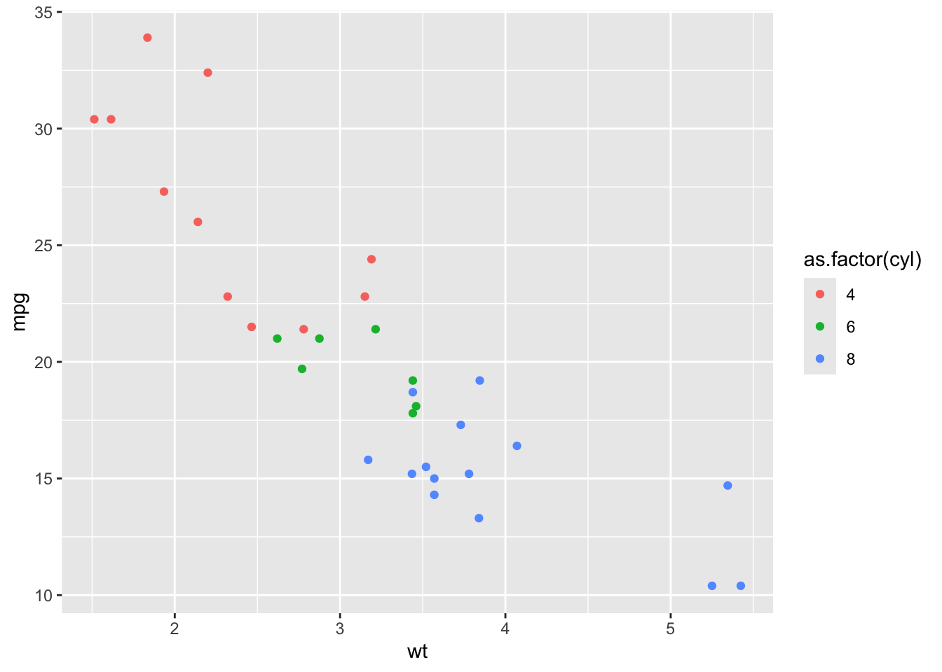
5. Add Titles and Labels
Add a title, and labels for the x and y axes.
ggplot(data = mtcars, aes(x = wt, y = mpg, color = as.factor(cyl))) +
  geom_point() +
  ggtitle("MPG vs Weight of Cars") +
  xlab("Weight (1000 lbs)") +
  ylab("Miles per Gallon") +
  labs(color = "Cylinders")
6. Create a Boxplot
Create a boxplot to visualize the distribution of mpg for each cyl category.
ggplot(data = mtcars, aes(x = as.factor(cyl), y = mpg)) +
  geom_boxplot() +
  xlab("Cylinders") +
  ylab("Miles per Gallon") +
  ggtitle("Boxplot of MPG by Cylinders")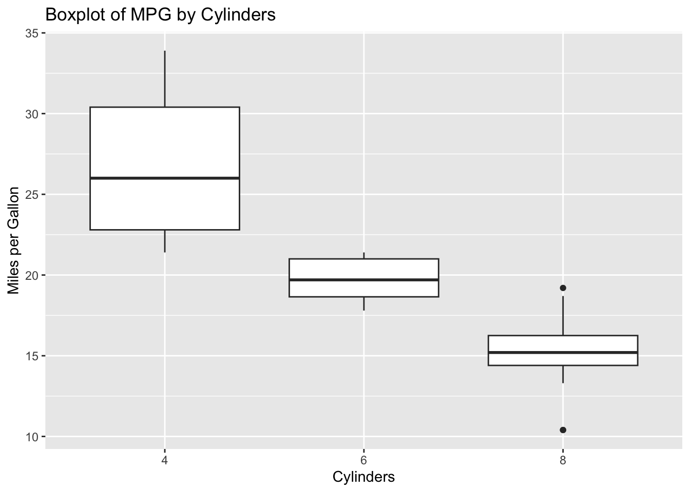
7. Create a Histogram
Create a histogram to visualize the distribution of mpg.
ggplot(data = mtcars, aes(x = mpg)) +
  geom_histogram(binwidth = 2, fill = "blue", color = "black") +
  xlab("Miles per Gallon") +
  ggtitle("Histogram of MPG")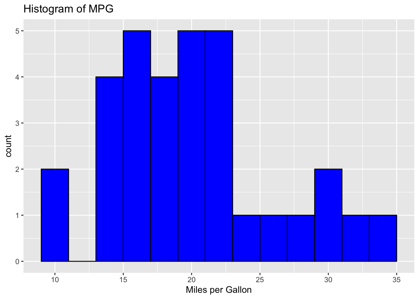
8. Create a Faceted Plot
Use faceting to create multiple plots based on the number of cylinders (cyl).
ggplot(data = mtcars, aes(x = wt, y = mpg)) +
  geom_point() +
  facet_wrap(~ cyl) +
  xlab("Weight (1000 lbs)") +
  ylab("Miles per Gallon") +
  ggtitle("MPG vs Weight Faceted by Number of Cylinders")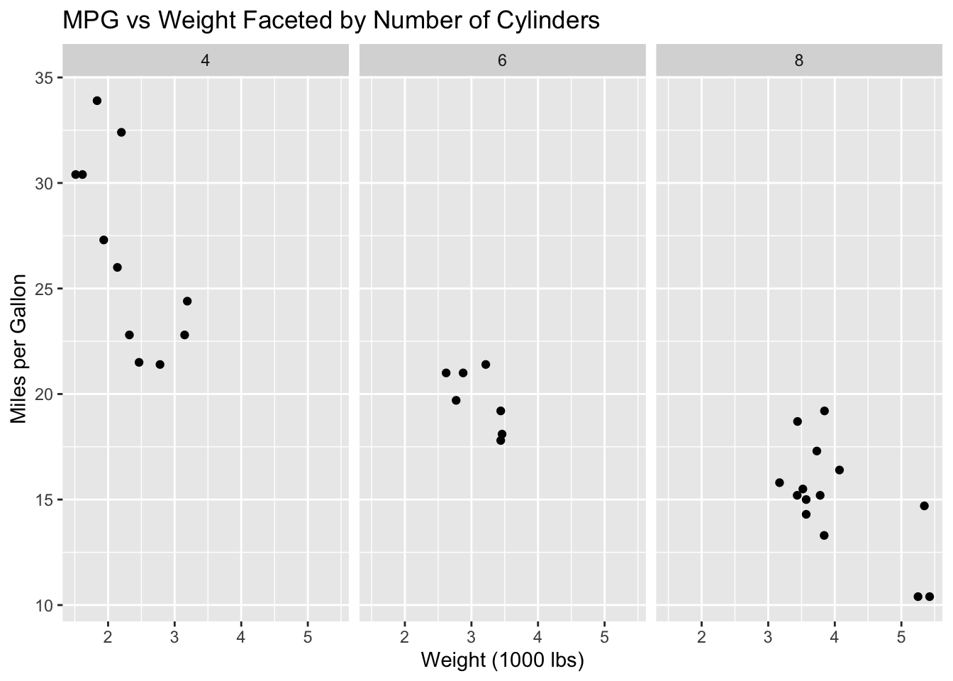
Additional Customizations:
- Change Themes: Try different themes such as
theme_minimal(),theme_classic(), etc. - Modify Point Shapes and Sizes: Use the
shapeandsizeaesthetics ingeom_point(). - Save the Plot: Use
ggsave()to save your plot to a file.